
ZumVet (Website)
Online vet care anytime, anywhere.
Overview
My Role
Duration
2 Months
Platform
Web & App Responsive
Full-time UX Design Lead
Duration
2 Months
Platform
Web & App Responsive
Tools used
Pen & paper, Google Documents, Mural,
Adobe Suite, FigJam & Figma
Responsibilities
Project Research, Ideation, UX Interface Design, Wireframe, Prototyping, Design System, Creative Direction, Testing
Pen & paper, Google Documents, Mural,
Adobe Suite, FigJam & Figma
Responsibilities
Project Research, Ideation, UX Interface Design, Wireframe, Prototyping, Design System, Creative Direction, Testing

Background
ZumVet is a leading online veterinary clinic in Singapore that provides a range of affordable and accessible pet care services, which includes teleconsultations, house visits, in-person clinic care, prescription refill and medication delivery.The Goal
To enhance the website's presentation of a modern and professional healthcare provider image, thereby increasing brand awareness and site traffic. Additionally, to add pages for newly launched services, Visit a Clinic and Memberships.The Challenge
To create a cohesive and intuitive website focused on user’s discovery and education experience. To ensure the homepage main scoll conveys the company’s core business proposition at a glance and showcase key services to the target audience.Discover & Define
With the exisiting website in place, we had to re-evaluate the website’s sitemap, information architecture and flow in order to ensure any new changes would be cohesive to exisiting content flow and assets. We did an internal design workshop to audit the website, removing unrelevant information and realigning our team’s vision and goals. The outcome of the workshop was to focus on: (A) Iteration of Homepage (B) Add Landing Pages for Clinic & Specialty Consults (C) Update Memberships Landing Page (D) Remove Connect Landing Page (Service no longer in operation) (E) Deprioritise Med Refill Landing Page (Shift in business focus) (F) Add Corporate Category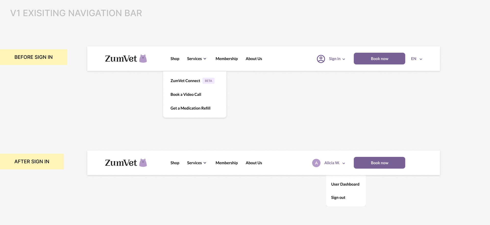
In order to further identify the gaps of the existing website to increase user relatability, we conducted both competitive and comparative analysis from direct competitors both local and international, and also businesses who uses similar business models and concept. This analysis enabled us to gain a deeper understanding of what key informations are presented and how they are presented. Leveraging on the clinical data we collected over the past 6 months, we were also able to get a better understanding on what are the common symptoms and illnesses that pet owners search for and/or visit the vet for. This insights allowed us to have a better direction as we planned and structured our information architecture of the website & homepage to ensure that the information flow and content design is intuitive and relatable to the target audience.
We conducted user interviews with 10 individuals who have experience being pet owners. By understanding their habits, behaviours, considerations on how they approach managing and maintaining their pet’s health, we synthesized the data using affinity mapping to identify common themes and patterns.
We learnt that users:
- Are price sensitive when it comes to pet care
- Prioritise proximity when deciding to visit a vet
- Are familiar with the concept of telemedicine
- Would often troubleshoot independently and observe their pet’s condition for a period of time before deciding to visit a physical vet
- Rely heavily on advices and reviews within the pet community to inform their pet care decisions
- Would tend to visit different vets (~1-3) before deciding on 1 to commit
- Would read up on the vet’s background to inform their decision to visiting a clinic
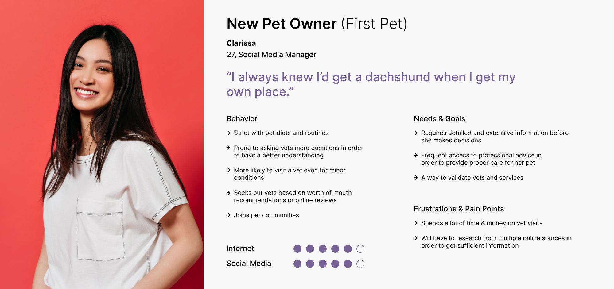
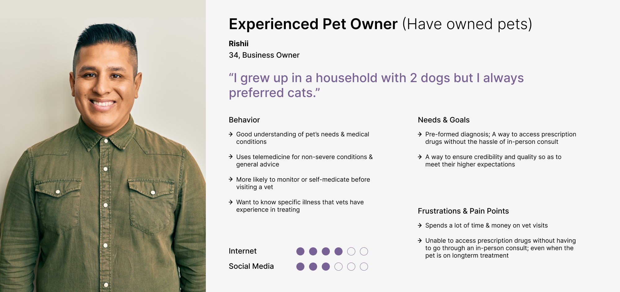
With the data and insights we discovered from the research & interviews, we were able to define and design the 2 main personas of our target audiences — (A) New Pet Owners & (B) Experienced Pet Owners, that will help guide the project.
Develop and Deliver
Using the data from our research, analysis, user interviews and personas’ needs and pain points, we brainstormed ideas on how might we highlight ZumVet’s business proposition, how might we showcase key services, how might we increase brand confidence, how might we guide users to find information they require quickly.To include information about new services and features, we reviewed the existing sitemap and proposed a new sitemap category structure base on our hypothesis and intuitive evaluation. In order to validate our proposed categories for the sitemap and navigation bar, we did a round of card sorting with 8 individuals. Base on the results collected, success rates for all questions fared above 90% out of a 100%.

With these topics, we decided to created different versions of the homepage in order to conduct different experiments and A/B testing for copywriting, content angles, and CTA placements.
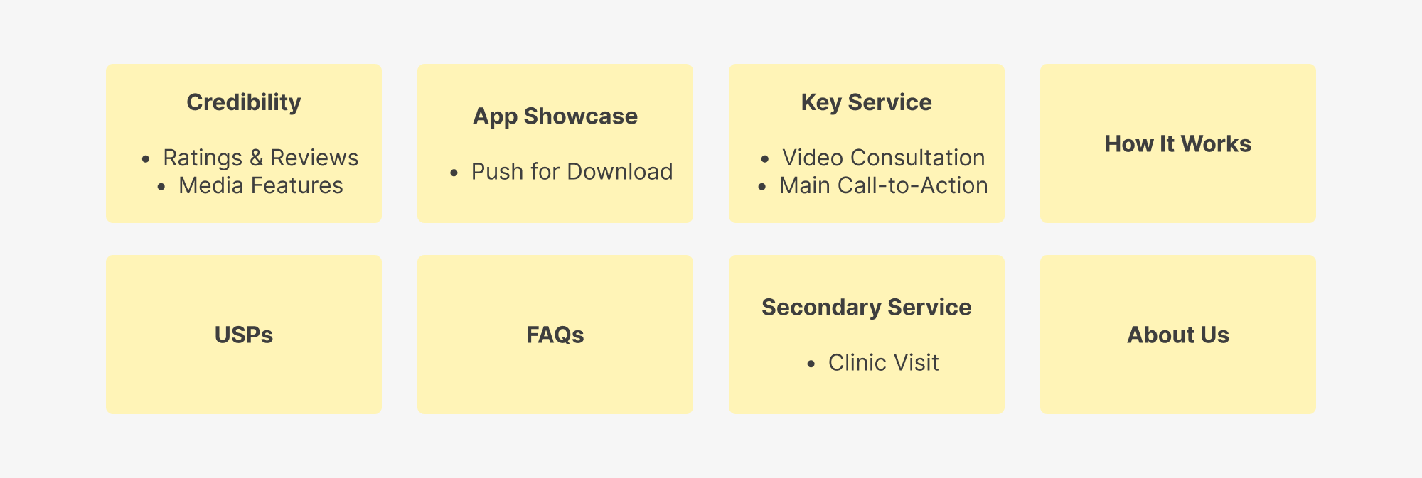
Homepage Wireframes


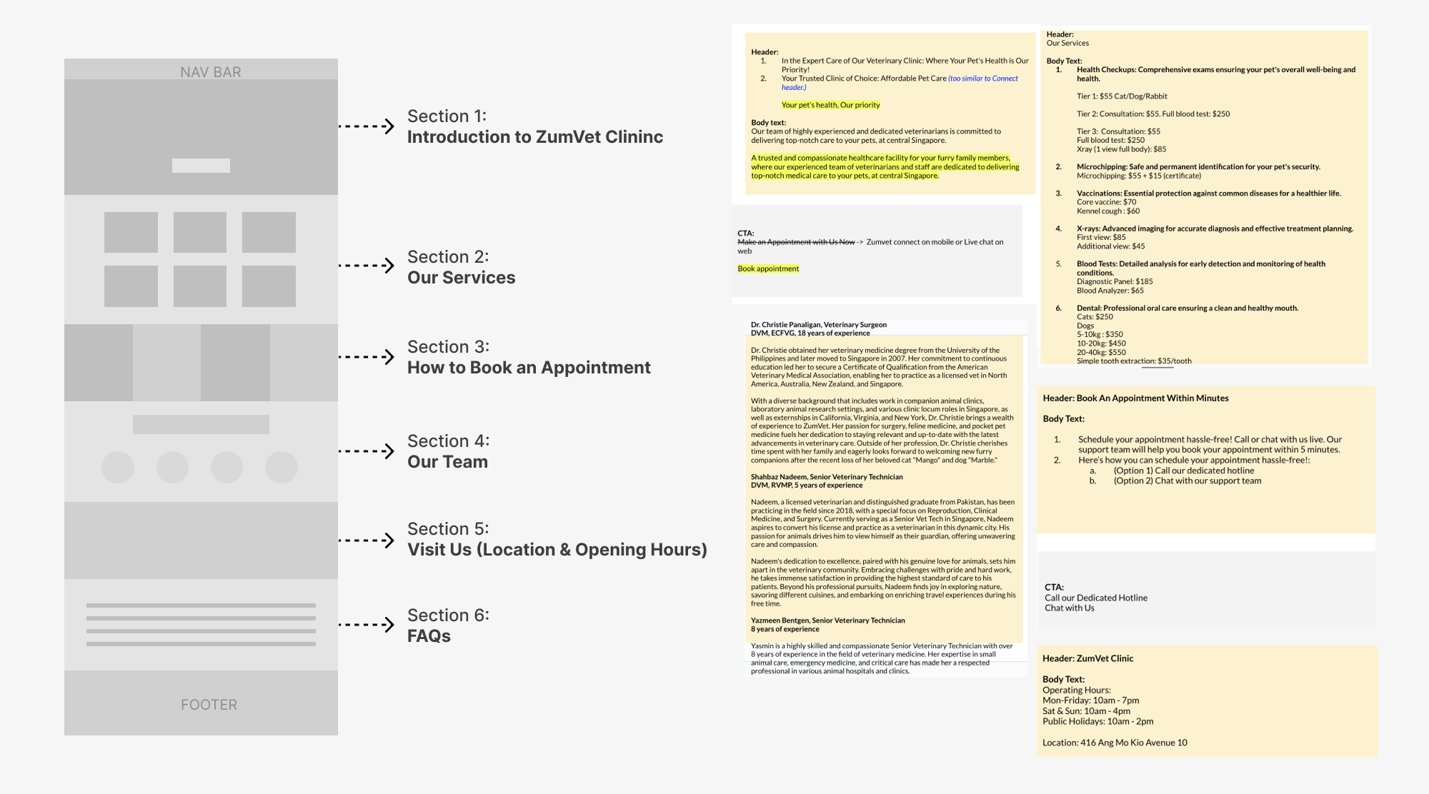
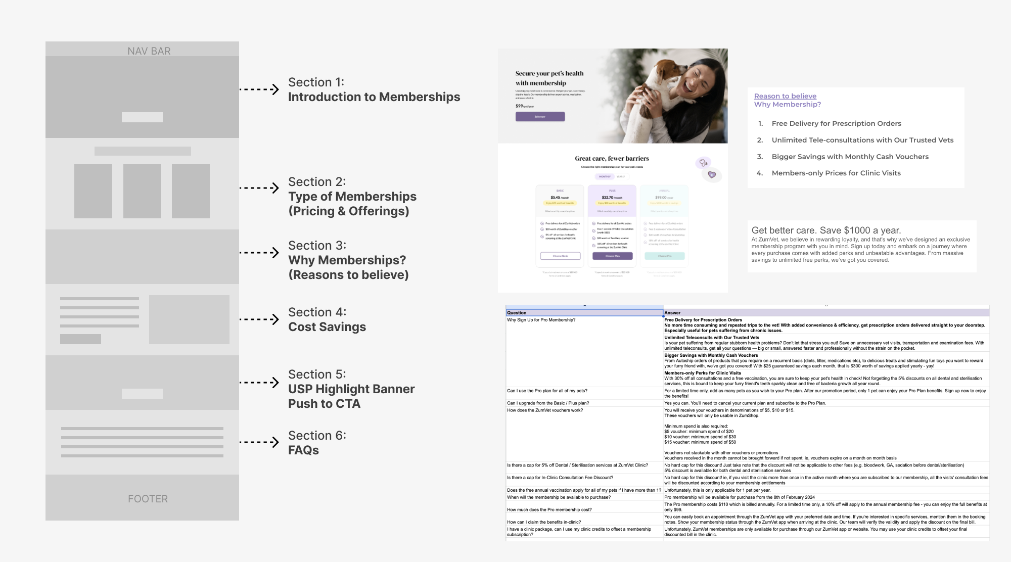
For adding and updates to landing pages (Clinic, Speciality Consult & Memberships), the design and marketing team worked closely to come up with the content and copy. We started with lofi-wireframes for flow and structure planning and moved to mid-fi wireframes.
Lo-fi Clinic Landing Page
Specialty Landing Page

Membership Landing Page
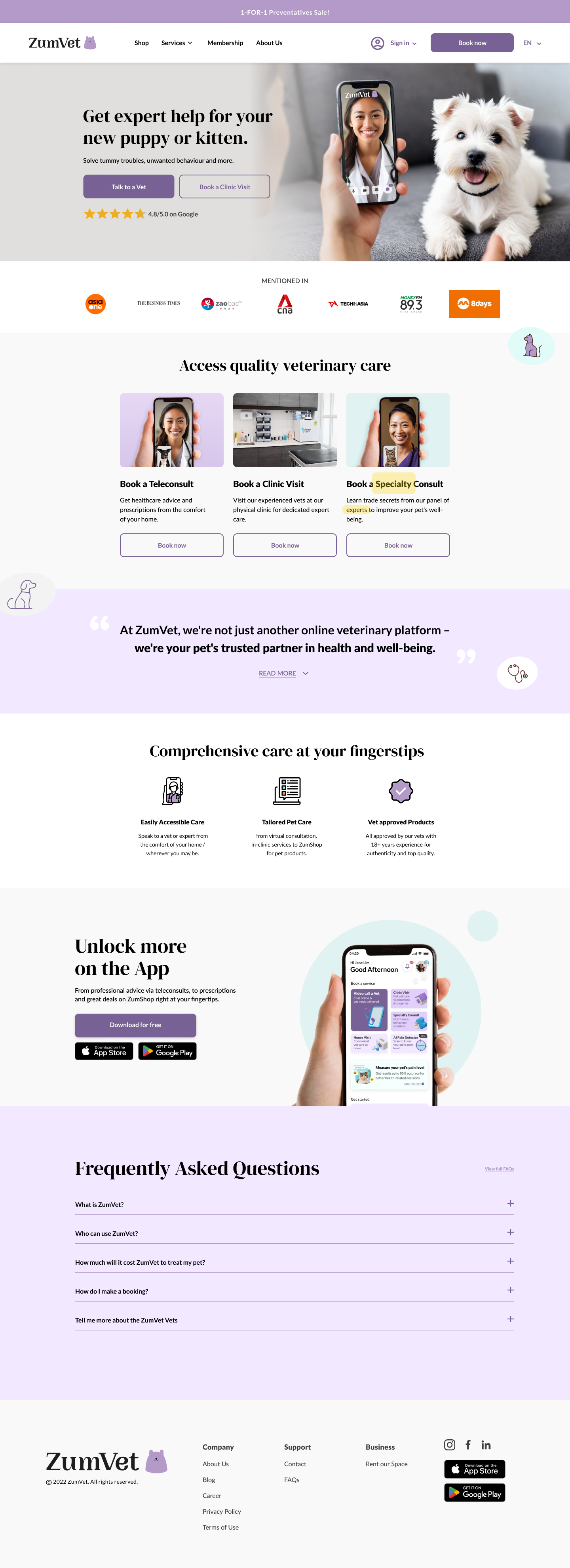
Final Iteration
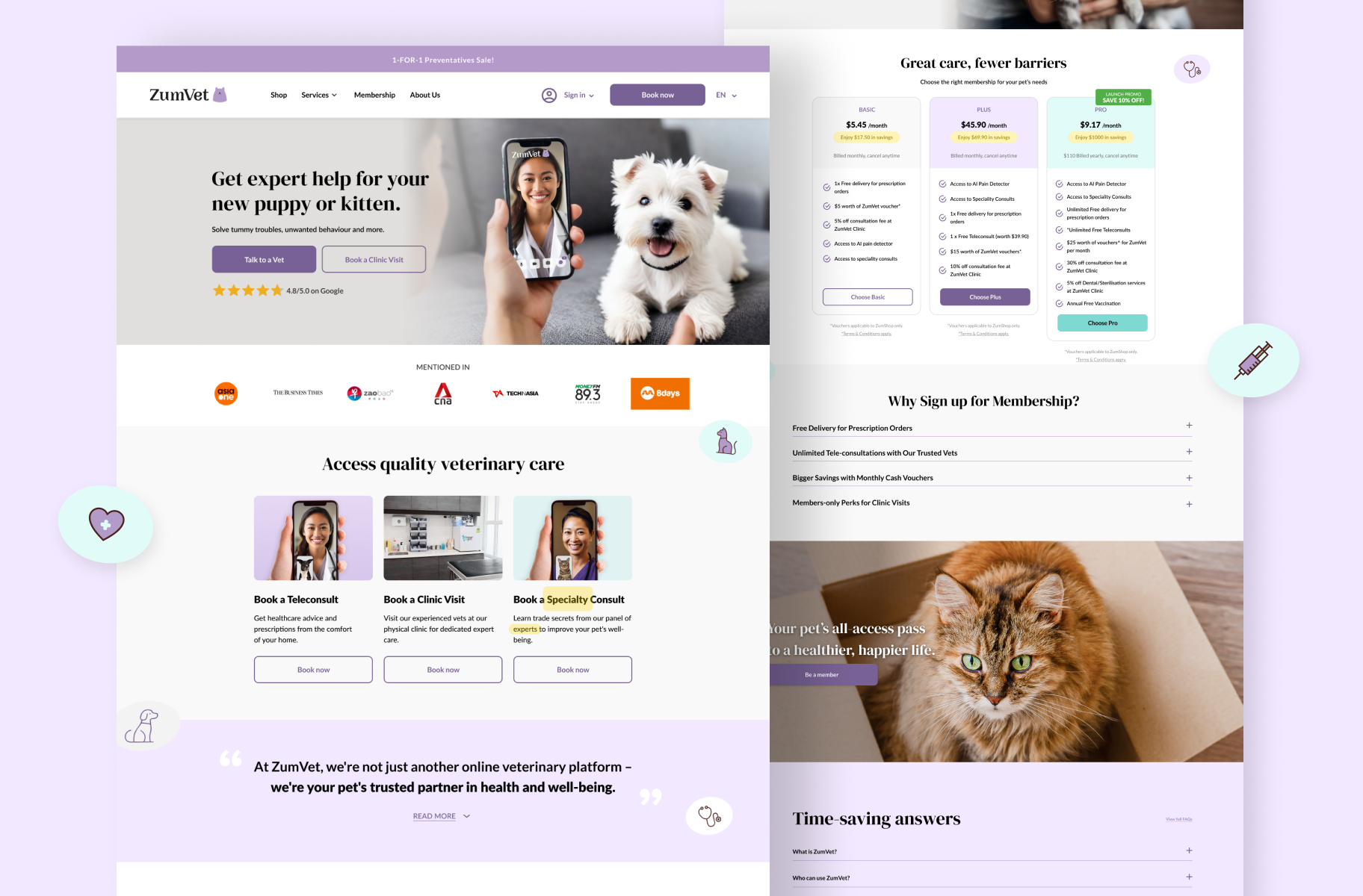
Key Product ScreensHomepage
![]()
Membership![]()
Clinic Landing Page
![]()
Speciality Consult Landing Page
![]()

Connect Landing Page (Disabled)
![]()
Sign In/Sign Up![]()

Outcome & Impact
- ~9000 app downloads (last update Sep 2024)
- Direct website traffic (Oct - Nov) increased 38.46%
- Direct website traffic (Nov - Dec) increased 47.22%
- 68.57% increase in New User traffic