
Tribecar
Affordable hourly car rental, now everyone can drive.
Overview
Type
Conceptual
Conceptual
Team
UX team of 4
UX team of 4
Duration
2 Weeks
2 Weeks
Responsibilities
Project Management, Ideation, Project Research, UX Interface Design, Creative Direction
Project Management, Ideation, Project Research, UX Interface Design, Creative Direction
Platform
Desktop & Mobile (iOS)
Desktop & Mobile (iOS)
Tools used
Pen & paper, Google Documents, Overflow, Mural, Optimal Workshop & Figma
Pen & paper, Google Documents, Overflow, Mural, Optimal Workshop & Figma

Brief
Redesign of the desktop and mobile responsive interfaces to improve the UX journey of Tribecar’s platform, create a hi-fi prototype and validate solutions with usability testing results.Approach
Tribecar is an affordable hourly vehicle rental service in Singapore that was established in 2015. Being one of the first online car rental services that allow users to easily access the car with their mobile devices, it was able to gain a huge following and early adopters of the service.The goal of this project was to uncover insights from car renters and identify the behaviors, considerations and habits in their current car renting journey in order to discover the gaps in their current user journey with Tribecar that can be solved by simplifying the core user experience and improving key features to promote a smoother and more efficient flow that allows the users to achieve their goals. We also aimed to create a consistent and coherent UI across all devices and screens that is reflective of the company’s brand image.
Discover and Define
In order to identify the problem areas, my team did a thorough research on Tribecar’s service platform, business model and referenced existing information online consisting of Youtube Tutorials, Youtube Reviews, Tribecar Facebook Page and Community Reviews. To discover the gaps in the current user journey, we conducted a heuristic evaluation using the Jakob Nielsen's 10 Usability Heuristics for User Interface Design on the exisiting interfaces on both devices, website and mobile and did user interviews with 13 individuals — 8 Tribecar users and 5 other car rental users.By understanding their habits, behaviours, considerations on how they rent cars, we synthesized the data using affinity mapping to identify common themes and patterns.
We learnt that users:
- Rent cars for events that happen occasionally and are not part of their daily routine.
- Felt that the Tribecar sign-up process is tedious.
- Prefer mobile access as it is much more convenient; able to receive direct notifications from the service.
- Prioritise renting a vehicle that is of closer proximity to their house.
- Mainly rent vehicles because they are unable to afford the cost of owning a car and considered it to be cheaper and more convenient than booking a cab.
With the data and insights we discovered from the research & interviews, we designed a primary persona to whom the website is going to be designed for and would also allow for easy reference to help further guide the project.

Meet Justin Chong, a 32-year-old PR manager who lives with his spouse. He enjoys spending time with his family and friends and got his driving license a year ago. He is not able to afford the cost of owning his own car but enjoys renting cars for planned outings with family and friends as he prefers the flexibility of being able to control his journey freely as opposed to having to plan his schedule around booking a cab.
We came up with a problem statement for Justin to help convey what his primary need is when it comes to car renting.
...
Justin needs a more efficient way to rent a vehicle that suits his needs in order to perform his planned tasks.
...
Our team created a customer journey map (CJM) for Justin. It reflects how the current Tribecar interface impacts the user’s goals and emotionals over 4 segments. We created the CJM based on both our cognitive walkthroughs, direct user insights and findings. 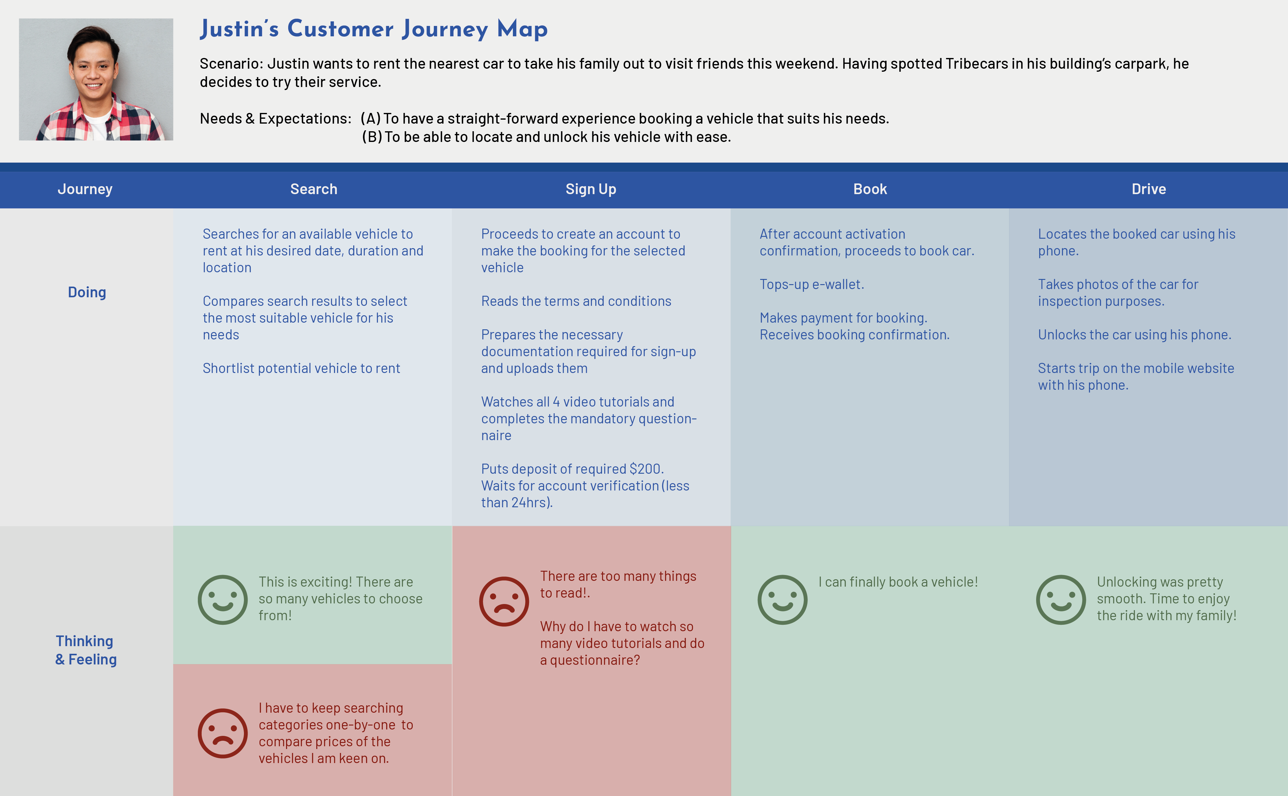
For Justin, there are several areas and opportunities that can be explored to strengthen his experience with Tribecar. He needs a more streamlined sign-up process that allows for better adoption rate, an intuitive navigation that allows him to locate information he needs more efficiently and a better search feature with added flexibility in search parameters that helps reduce the probablity of failed searches.
Develop and Deliver
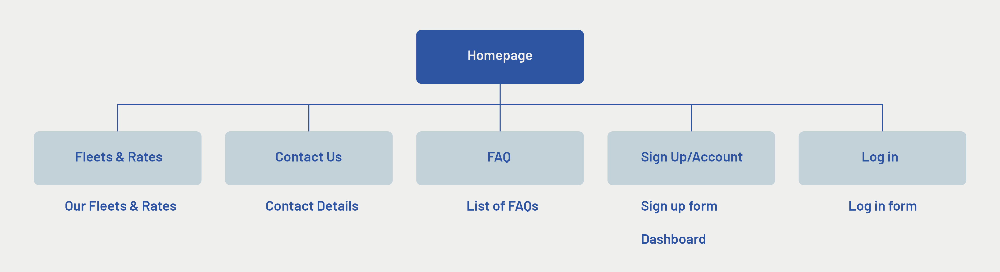
We focused on developing features that would bring the highest impact and value for both user and business — (A) Onboarding, sign-up/login, (B) Vehicle Search & (C) Vehicle Booking. To improve platform navigation, our team conducted an open card sort with 18 participants and 61 cards based on data harvested from the existing platform. After synthesizing the results, we identified key categories that we used to inform the main navigation bar of the website.
![]()
To validate the proposed sitemap to see if they were intuitive and clear, we carried out a tree-test with 18 participants using 3 questions. Base on the results collected, success rates for all questions fared above 90% out of a 100%. Our team did a competitive analysis and task analysis on Tribecar’s direct competitors, Shariot and BlueSg. We were able to gain valuable insights on their sign-up and booking processes that showed clear differences. Overall, Tribecar’s sign-up is significantly lengthier, requiring more document support and steps and booking is less intuitive with lack of helpful visual and information for users.
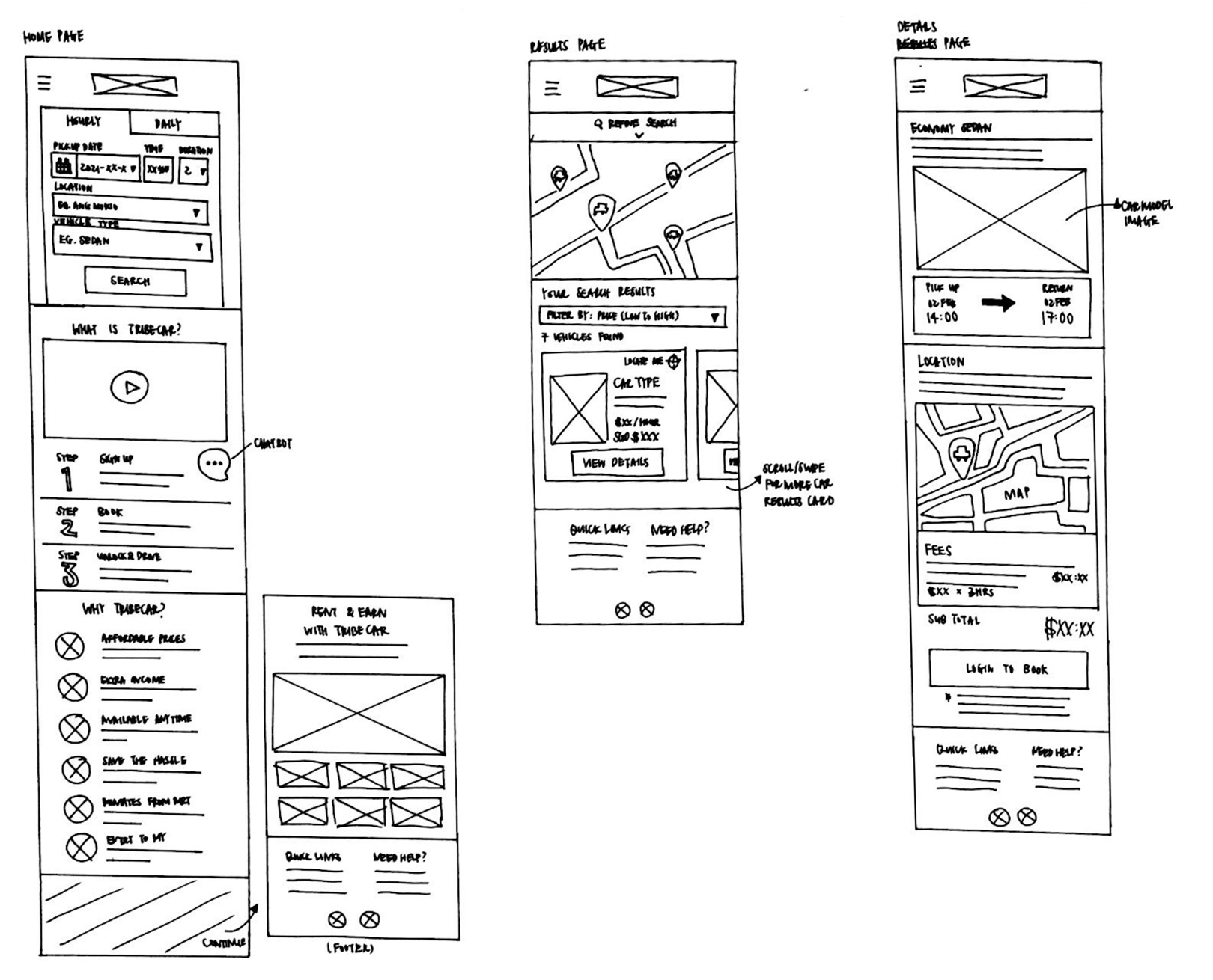
With the research data, we discussed, did sketches and came up with a wireframe with improvements on user flow, screen layout and feature designs. The key iterations focused making the sign-up process more comprehensive and guided. To improve the search bar and allow users to edit their search parameters for more convenience and efficiency. To enhance the booking process by allowing user to have more access to booking information before commiting to sign-up for an account and to include more useful details like car plate number and more car locating information.
We created the wireframe sketch with the mobile interface as Tribecar’s platform is prioritised for mobile usage with users having to unlock the car and end the trip with their phones. We aimed to optimise the mobile responsive website for mobile devices and adapt it to desktop.
To validate the proposed sitemap to see if they were intuitive and clear, we carried out a tree-test with 18 participants using 3 questions. Base on the results collected, success rates for all questions fared above 90% out of a 100%. Our team did a competitive analysis and task analysis on Tribecar’s direct competitors, Shariot and BlueSg. We were able to gain valuable insights on their sign-up and booking processes that showed clear differences. Overall, Tribecar’s sign-up is significantly lengthier, requiring more document support and steps and booking is less intuitive with lack of helpful visual and information for users.
With the research data, we discussed, did sketches and came up with a wireframe with improvements on user flow, screen layout and feature designs. The key iterations focused making the sign-up process more comprehensive and guided. To improve the search bar and allow users to edit their search parameters for more convenience and efficiency. To enhance the booking process by allowing user to have more access to booking information before commiting to sign-up for an account and to include more useful details like car plate number and more car locating information.
We created the wireframe sketch with the mobile interface as Tribecar’s platform is prioritised for mobile usage with users having to unlock the car and end the trip with their phones. We aimed to optimise the mobile responsive website for mobile devices and adapt it to desktop.

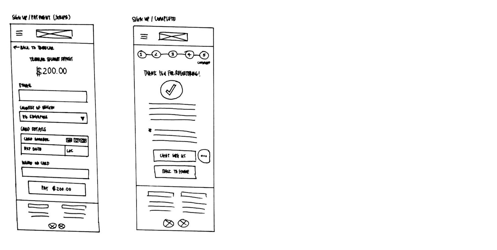
Using the wireframe, we created a design system for Tribecar and a hi-fi prototype for both mobile and desktop. The design system acted as a set of standards and guidelines for the UI interface. This would allow us to maintain design and layout consistency across all pages and devices when designing, which would help enhance and improve the overall user experience.
With prototype 1, we conducted usability testings on 10 individuals (5 mobile, 5 desktop) with an active driving license. They were given a scenerio base on our persona, Justin and the 3 key tasks to accomplish. We are able to observe and collect insightful data and findings. Each participant was made to complete the Single Ease Question (SEQ) 7-point rating scale after each task to assess how difficult they found the task and the System Usability Score (SUS) survey to measure the overall usability of prototype 1.
We were able to observe an improvement in both scorings in prototype 1 as compared to the existing interface. Base on the results of prototype 1, we found that users wanted a more convenient way to access vehicle information, models and prices. They also tried to access information by tapping or clicking on spaces within the car card instead of the call-to-action button as they assumed the entire card to be clickable and users wanted additional information like the vehicle number plate to be reflected in the booking confirmation page for more assurance. Our team discussed and designed new solutions to improve the experience and solve the identified problems. We created a second round of design iterations on both mobile and desktop interfaces.
We conducted a second round of usability testing on 10 individuals (5 mobile, 5 desktop) with the same scenerio and set of tasks. Likewise, each participant completed the SEQ after each task and SUS survey for prototype 2. We were able to observe an improvement in both scorings in prototype 2 as compared to prototype 1. Base on the results, users were confused by the ‘NOW’ input reflected in the Time parameter of the search bar as it did not give them clear context on the actual booking time, users would like to have visual references on the Fleets and Rates page for easy reference and users felt that booking add-ons should be presented earlier in the booking process for a better experience.
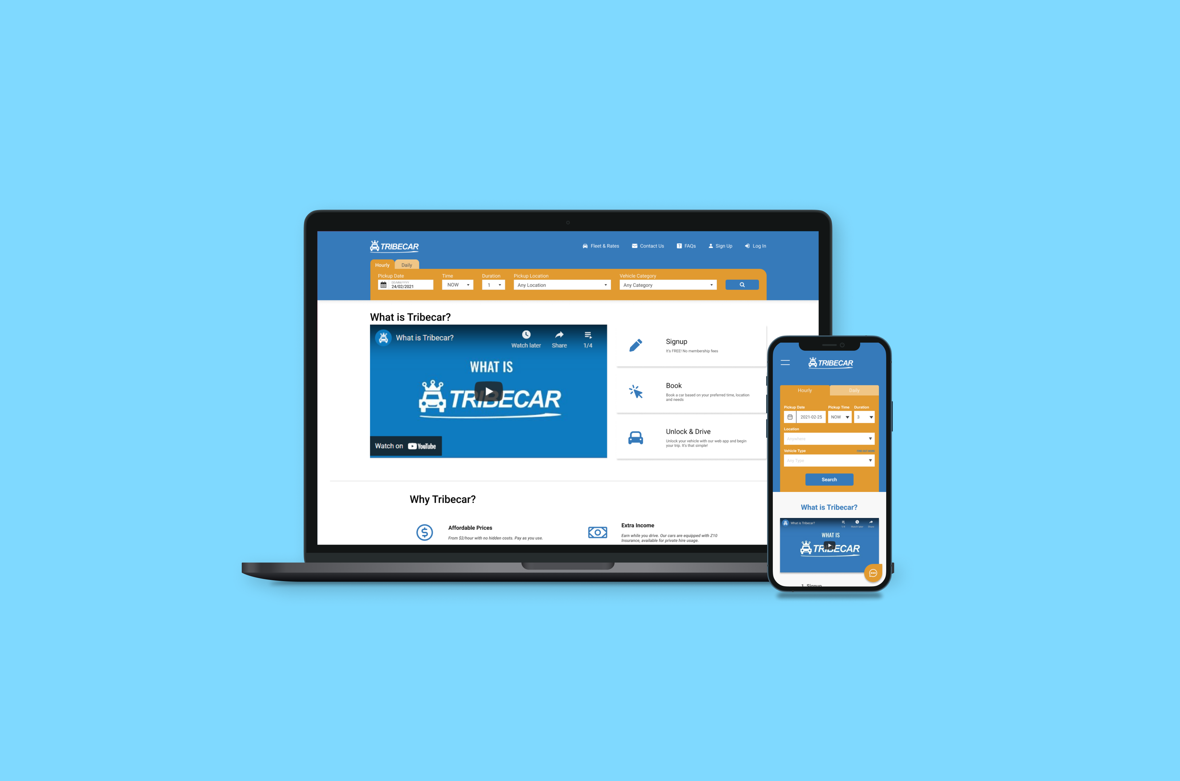
Key Product Screens (Desktop)
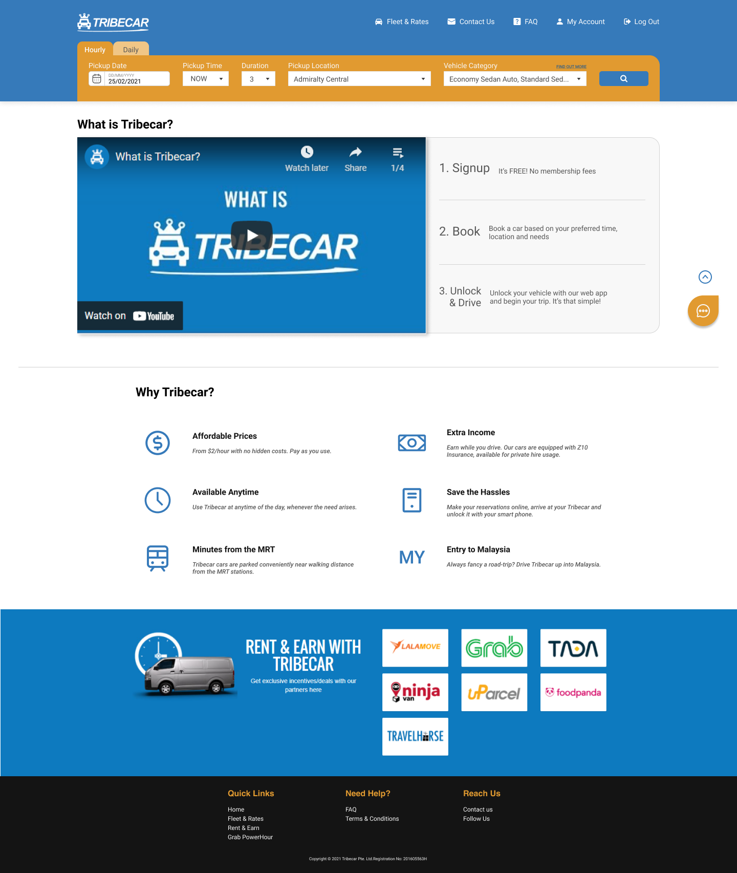
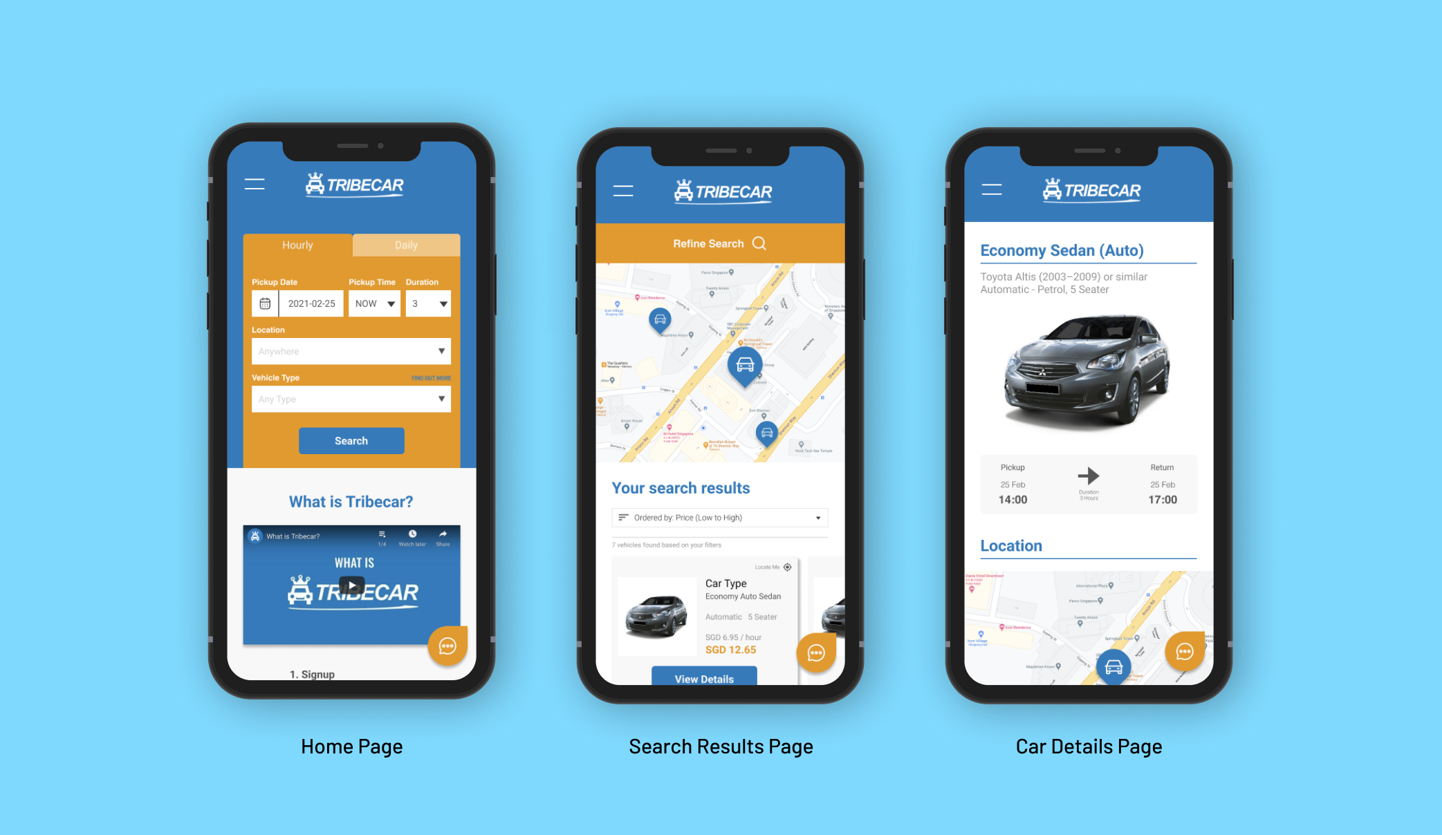
Home Page
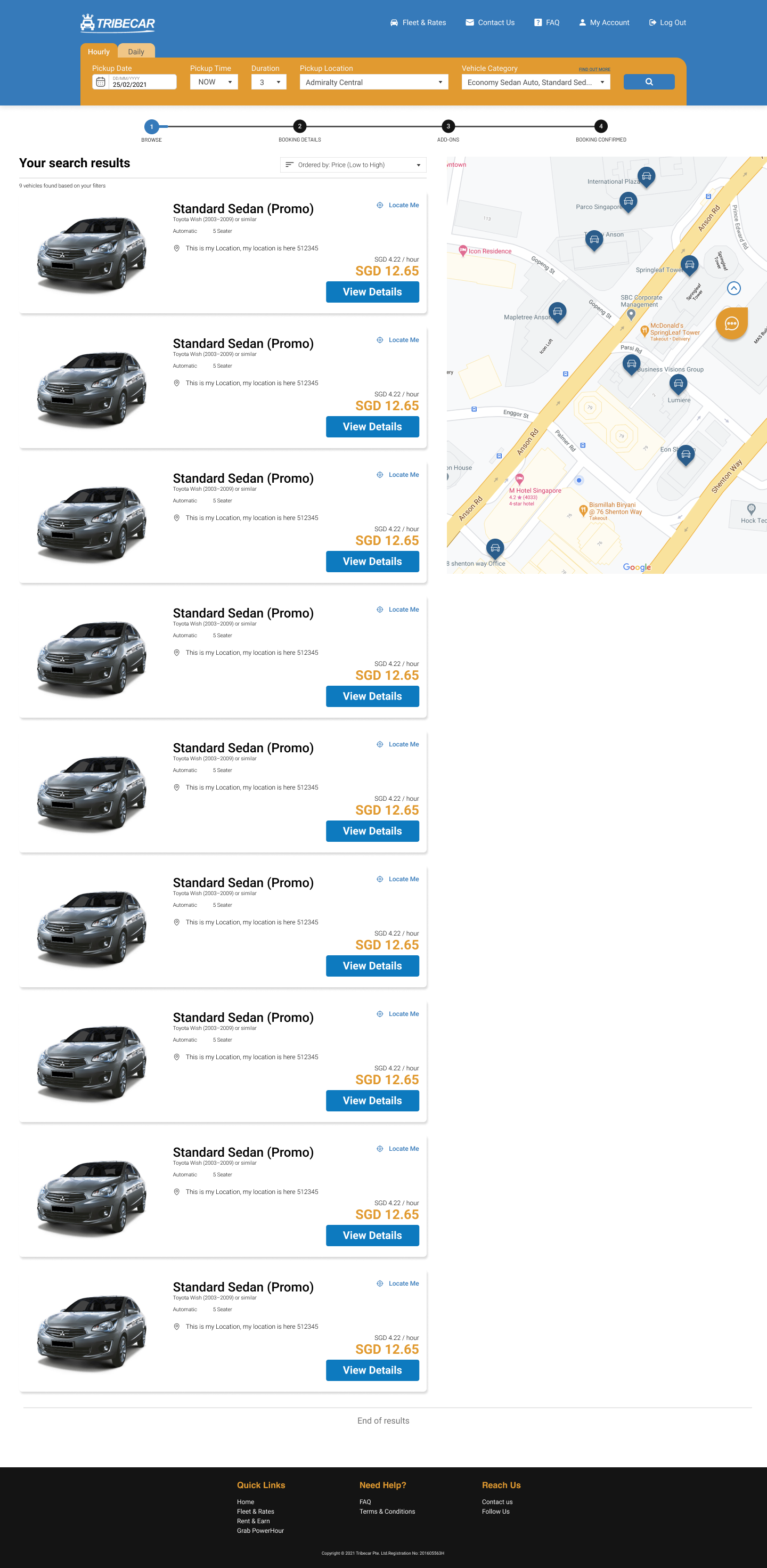
Search Results Page

Car Details Page

Login Page
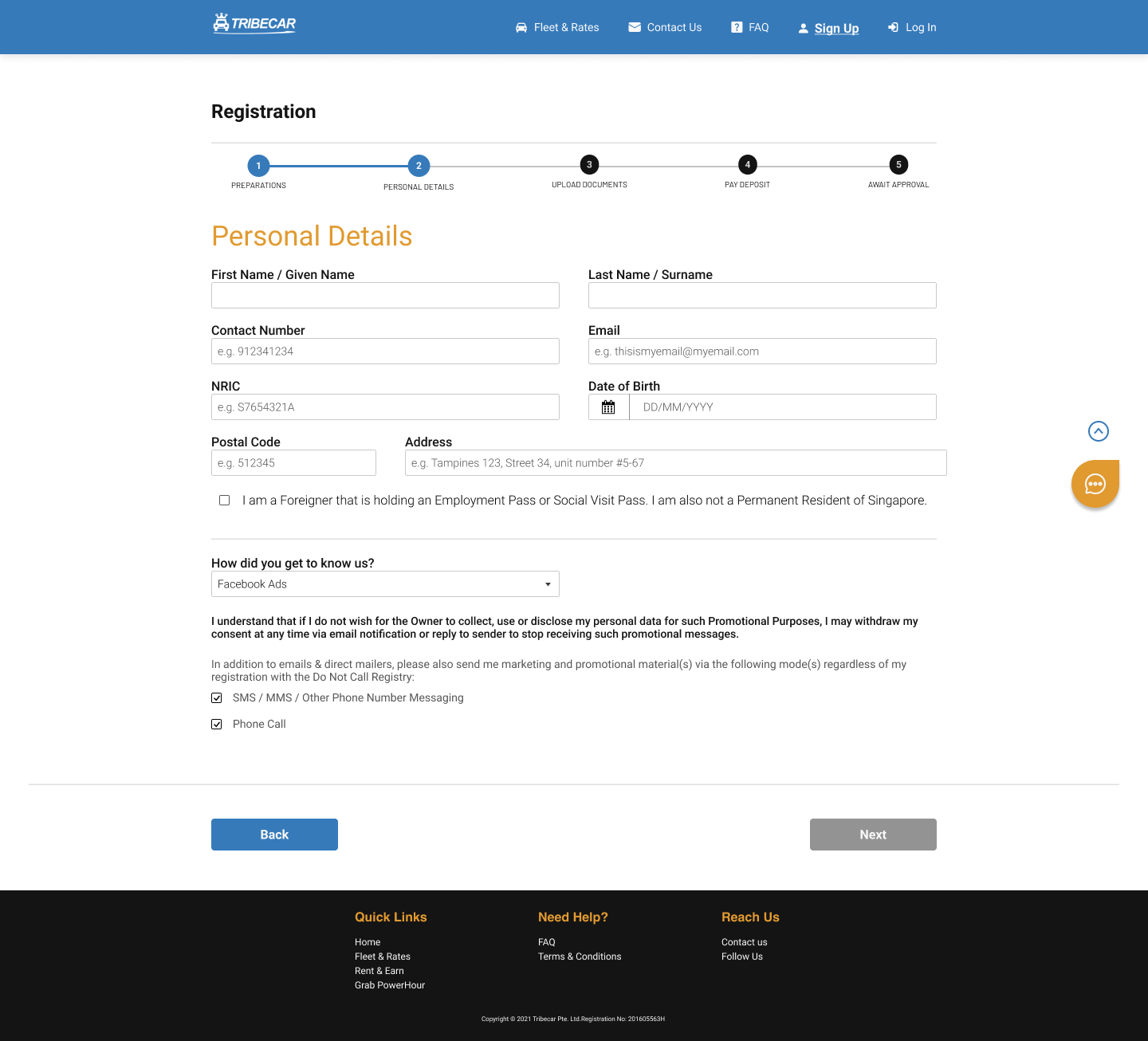
Login Page (Personal Details Form)
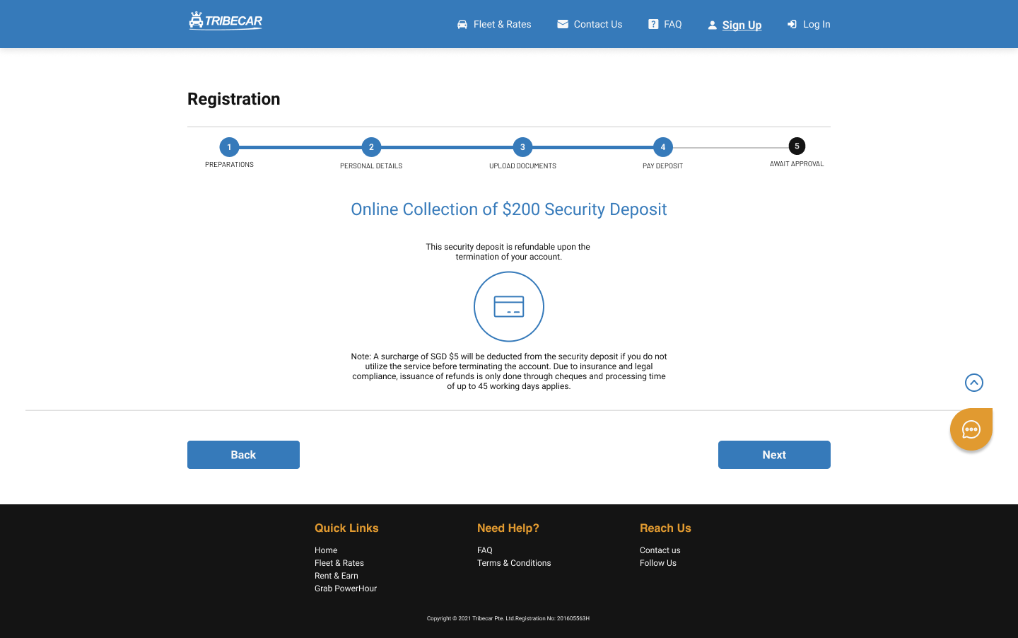
Security Deposit Page

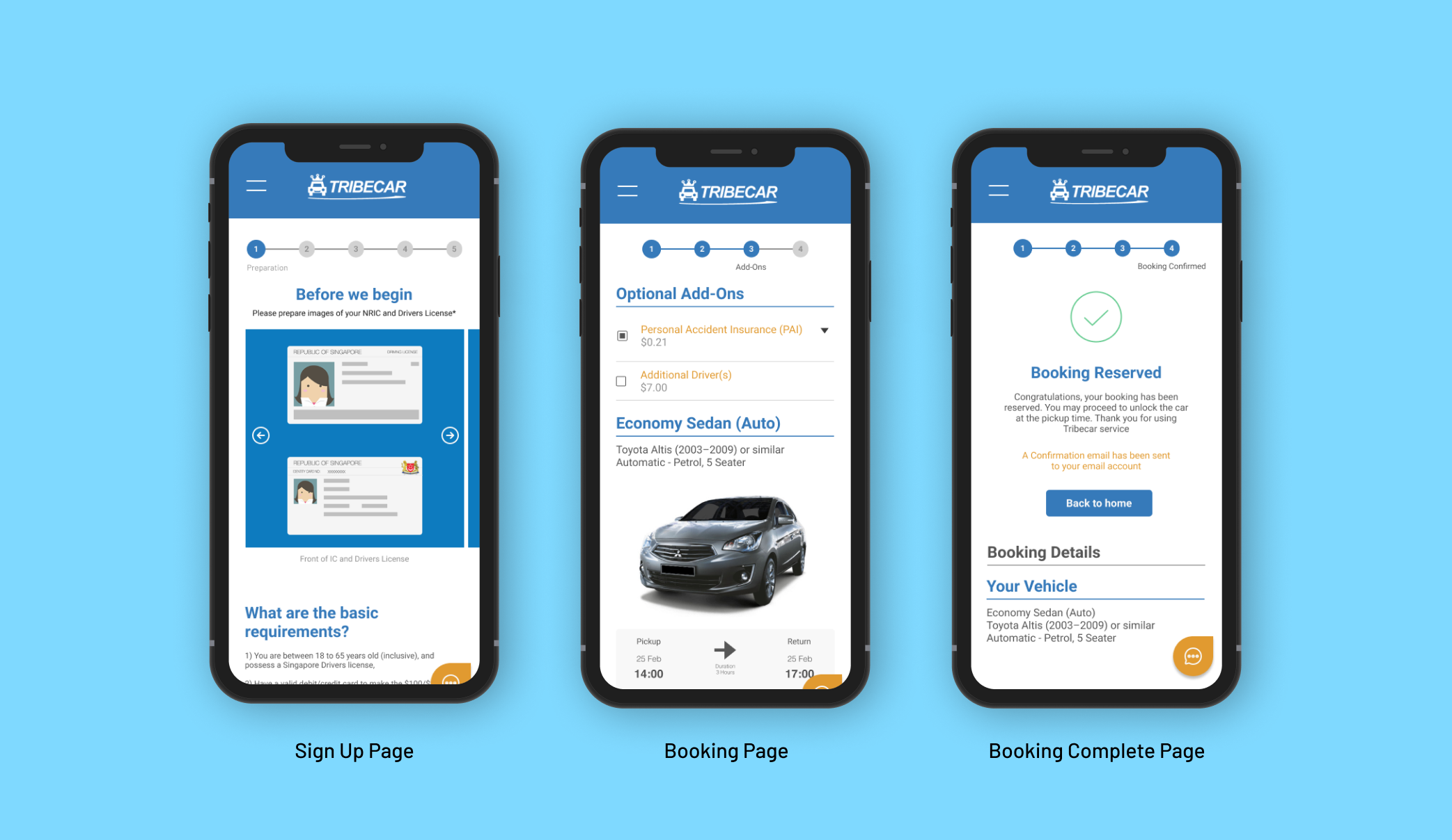
Booking Page
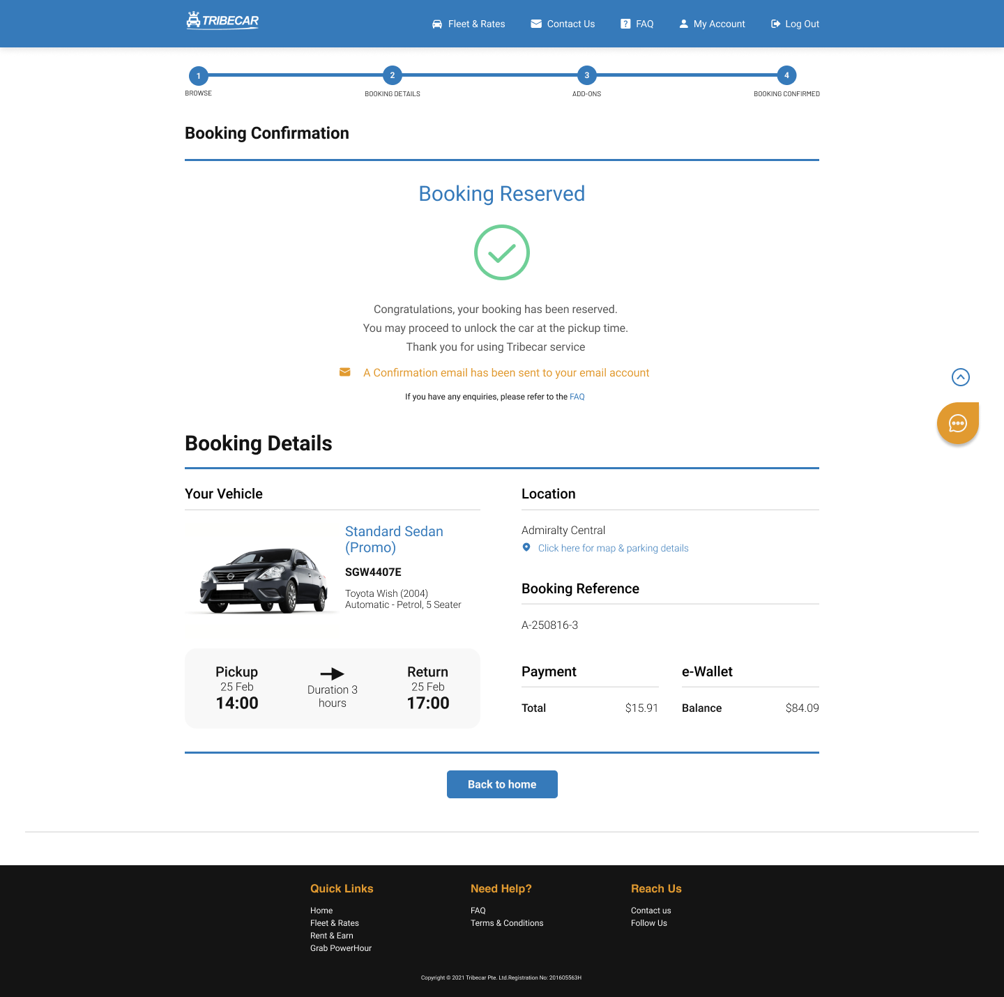
Booking Complete Page
Key Product Screens (Mobile)
As we concluded the results and insights we gathered from the testing of prototype 2, we came to the e of the 2 weeks project timeline and wrapped up our research, reports and design outputs. We shared the outcomes in a presentation, prototype walk-through demo and discussed potential next steps for Tribecar. Our team was able to improve the overall UX experience with validated results and answers to Justin’s problem statement of needing a efficient way to rent a vehicle that suits his needs in order to carry out his planned tasks.
Next Steps
Moving forward, we plan to continue making iterations to the prototype based on the findings & conduct another round of usability tests. We would also like to look into making the Vehicle Search & Booking process even more straight-forward & efficient for regular Tribecar users by exploring features like Saved Searches or Wishlist/Bookmark. We also will like to explore and develop more into the post-booking user experience to see how we can enhance it & encourage more user loyalty for the brand to promote user rentention. Learnings & Reflections
1.
︎︎︎Having a clear, detailed and realistic project timeline was very critical and beneficial when working in a team. As it allows for tasks to be allocated efficiently and for the whole team to be aligned with project timelines and progress. When we initially begun the project, we did a high-level project timeline overview but quickly realised we would require a more detailed one as the project runway was very short having only 2 weeks and that we all have different varying schedules.
︎︎︎Having a clear, detailed and realistic project timeline was very critical and beneficial when working in a team. As it allows for tasks to be allocated efficiently and for the whole team to be aligned with project timelines and progress. When we initially begun the project, we did a high-level project timeline overview but quickly realised we would require a more detailed one as the project runway was very short having only 2 weeks and that we all have different varying schedules.
2.
︎︎︎Working in a team can be challenging as each individual might have a different working style but with clear communication and an open mindset, we were able to work well together. It was interesting to see how different methods and approaches add into the whole team dynamic and synergy. Each individual had their own strength and interest and I think that led us to naturally take on different roles and responsibilities in the project which worked well as we were able to cover all aspects of the project.
︎︎︎Working in a team can be challenging as each individual might have a different working style but with clear communication and an open mindset, we were able to work well together. It was interesting to see how different methods and approaches add into the whole team dynamic and synergy. Each individual had their own strength and interest and I think that led us to naturally take on different roles and responsibilities in the project which worked well as we were able to cover all aspects of the project.
3.
︎︎︎It was my first time working so closely with a team of UX designers and it definitely was a refreshing experience which I enjoyed and was able to learn a lot from. This makes me look forward to the future teams that I would be working with next time and what I can learn and bring to the table.
︎︎︎It was my first time working so closely with a team of UX designers and it definitely was a refreshing experience which I enjoyed and was able to learn a lot from. This makes me look forward to the future teams that I would be working with next time and what I can learn and bring to the table.