Burpple
Beyond
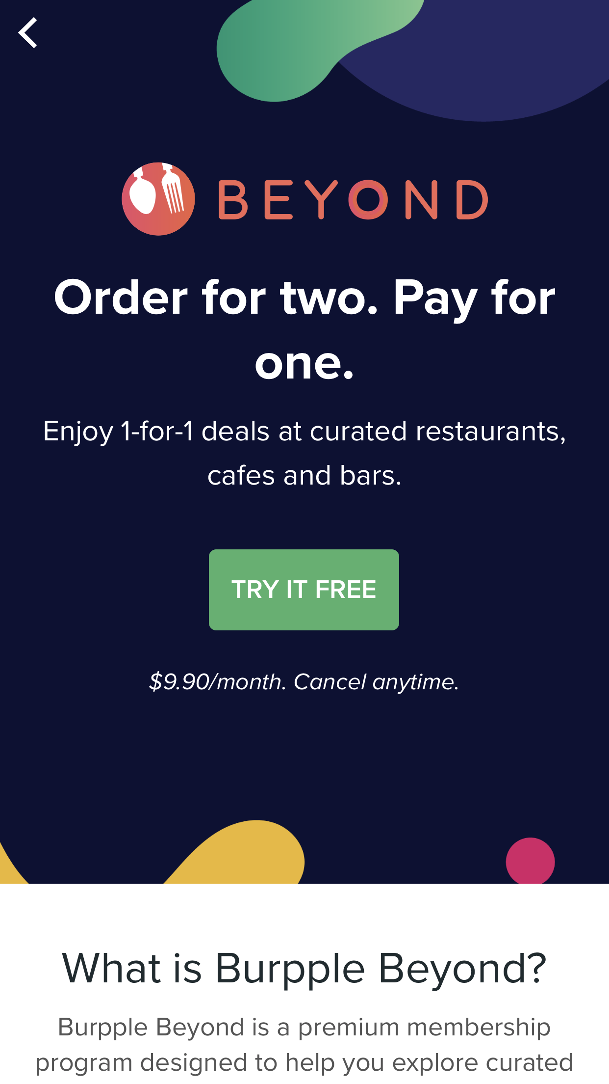
Order for two. Pay for one.
Overview
Client
Burpple
Burpple
Responsibilities
Branding, Conceptulisation, Graphic Design, Creative Direction, Flat Design
Branding, Conceptulisation, Graphic Design, Creative Direction, Flat Design
Type
Branding, Digitial & Print Campaign
Branding, Digitial & Print Campaign
Tools used
Pen & paper, Illustrator, Photoshop
Pen & paper, Illustrator, Photoshop
Brief
To create the branding for Burpple Beyond, a dining membership programme under Burpple and provide creative solutions for the launch campaign.Approach
The aim was to position Beyond as an exciting and middle to high-end dining app. The brand design uses vibrant gradient colors, fluid shapes and vector graphics to simulate a fun and energetic dining experience that Beyond has to offer to their users. This was translated to the UI and flat design for both web and mobile interfaces.Logo & Brand elements
The logo is created to be a sub-brand to Burpple hence it uses the same visual of the fork and spoon. The Beyond type logo uses a round typeface that compliments the circle fork and spoon icon. There was special emphasis on the O in the Beyond type logo to symbolize the holistic relationship between merchants, community and Burpple. The gradient treatment and addition of orange not only compliments the Burpple Pink, but also refreshes the brand, conveying a modern and dynamic image.Flat Design
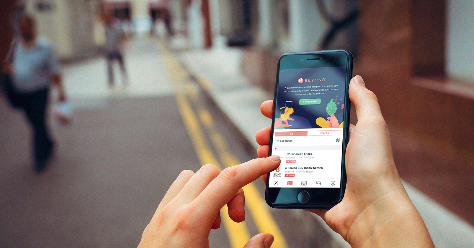
With the launch of Burpple Beyond, a mini website was created within the platform to introduce, onboard and market the service. To enhance the brand image and to convey the different key messages, flat design was created to help lessen the cognitive overload and provide an aesthetic visual element to the campaign and service.Using simple, two-dimensional elements paired with bright colors, I was able to create visual elements that were used across the UI.