Get to the Roots
Your plant problems, answered.

Overview
Type
Conceptual
Conceptual
Team
UX & Branding team of 1
UX & Branding team of 1
Duration
2 Weeks
2 Weeks
Responsibilities
Project Research, Ideation, UX Interface Design, Branding & Creative Direction
Project Research, Ideation, UX Interface Design, Branding & Creative Direction
Platform
Mobile (iOS)
Mobile (iOS)
Tools used
Pen & paper, Google Documents, Google Slides, Illustrator, Mural, Overflow, Sketch & InVision
Pen & paper, Google Documents, Google Slides, Illustrator, Mural, Overflow, Sketch & InVision
Brief
To create a lo-fi prototype for a new mobile app based on an identified problem and solution for a target audience.Approach
Convinced that you don’t have a green thumb? You’re not alone. Having plants in your living space can be either calming or a stressful hobby. Plants, much like a teenage child, are capable of experiencing different emotions & go through phases too. Learning to read their signs & language could prove to be challenging and require much more knowledge & insights.
The goal of this project was to uncover insights from plant owners and identify the gaps in their current plant care journey which can be solved with the app by allowing users to customise their inquiries, generate a custom diagnosis and obtain a prescribed solution that is backed by a real community.
Discover and Define
To begin the project, I conducted user interviews with 9 individuals that have experience caring for plants. By understanding their habits, behaviours, considerations and insights on how they take care of their plants, I synthesized the data gathered to identify common themes and patterns.I learnt that users:
- Do not know how to spot the signs that shows their plant is unwell.
- Are unable to decide which of the many different solution they found, applies to their plant problem.
- Do not know the exact amount of care their plant needs.
- Feel that getting advice & care information from real people is more reliable.
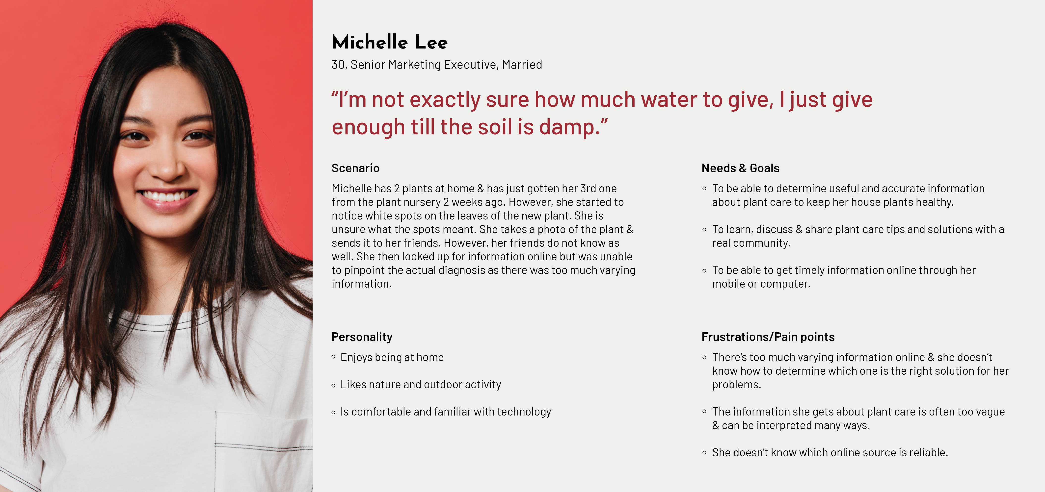
With the data and insights I discovered from the research, I designed a primary persona to whom the app is going to be designed for and would also allow for easy reference to help further guide the project.
...“You can overwater and drown a plant.”
...
“You can overwater and drown a plant.”
...

Meet Michelle Lee, a 30-year-old senior marketing executive who lives with her husband. She enjoys being at home, loves nature and occasional outdoor activities. She tries to incorporate nature into her living space in the form of house plants as they provide a calm energy. She looks fondly upon her plants as part of her low maintenance hobby and takes pride in seeing them thrive.
For Michelle, keeping in mind of her goals, needs and pain points, there are several concepts and opportunities that can be explored. I came up with a problem statement for Michelle to help convey what her primary need is when it comes to plant care.
...
A plant owner needs clear & accurate information about plant care so that their plants will not wilt.
...
Michelle needs more detailed and precise plant care information, ways to identify her plant problems and to be equipped with knowledge or tools to determine which solution would suit her needs and is reliable. With these insights, I explored on how might we communicate precise measurements for plant care? How might we keep plants healthy all the time? How might we filter the accurate information from the inaccurate information? Brainstorming solutions to answer Michelle’s key needs led me to 3 main features:
1. Basic Care to provide users with information base on plant type and family.
2. Consultation to allow users to customise their enquiries and get a tailored solution specific to their problem.
3. Community to share and endorse plant care tips and solutions, building information credibililty.
Develop and Deliver
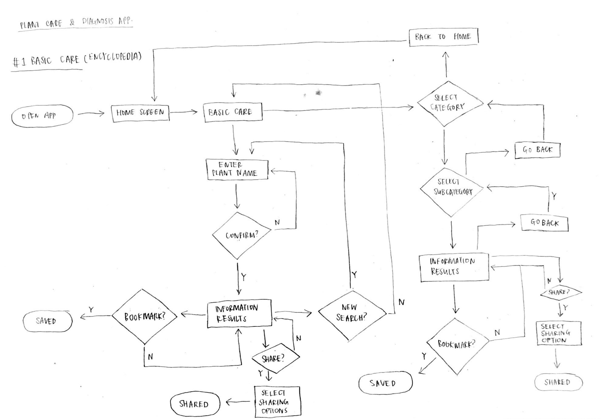
In order to plan the app, I created a basic user flow base on user’s personal experiences and the proposed features.

With the user flows as a guide, I sketched and designed the wireframe. I created a lo-fi prototype base on Michelle’s scenerio and task, and conducted a first round of usability testings with 5 individuals. I was able to observe how users interacted with the prototype 1 and collect insightful data and findings.

Base on the data collected from the testings, I learnt that users did not understand what “View Past Diagnosis” feature was, consultation user flow could be further streamlined to be more direct and efficient, users also did not understand the need for the pop-up confirmation request as the information they are providing are not sensitive nor personal and did not require a security confirmation process. The consultation form needed to be more comprehensive in helping the users identify their problems further, search results was too lengthy and risked user cognitive overload and “Start a new consultation” was not a suitable next step in the user flow as it was not intuitive.
With the findings and identified problems, I did a second round of design iterations, created prototype 2 and conducted usability testings with 5 individuals given the same scenerio and task.

Based on the results, I learned that users had clearer understanding about the key features presented in the main navigation, was able to complete the task more efficiently with little or no hesitations and found the results page more intuitive and comprehensive.
As I concluded the results and insights gathered, I came to the end of the 2 weeks project timeline and wrapped up the research, reports and design outputs. I shared the outcomes in a presentation and discussed potential next steps for Get to the Roots.
Next steps
1.
︎︎︎To explore other useful features like a Plant Tracker or Diary to allow users to document the growth of their plant. This would help them diagnose or identify the condition of their plants with easy reference, manage their anticipations and minimise the risk of delayed diagnosis.
︎︎︎To explore other useful features like a Plant Tracker or Diary to allow users to document the growth of their plant. This would help them diagnose or identify the condition of their plants with easy reference, manage their anticipations and minimise the risk of delayed diagnosis.
2.
︎︎︎To do more research and create the wireframes for the other pages of the main navigation (Basic Care and Community).
︎︎︎To do more research and create the wireframes for the other pages of the main navigation (Basic Care and Community).
3.
︎︎︎To create a design system for Get to the Roots to document and standardise overall design components. And create a mid-fi or high-fi prototype to conduct usability testings and gather more useful insights that would improve the design of the app.
︎︎︎To create a design system for Get to the Roots to document and standardise overall design components. And create a mid-fi or high-fi prototype to conduct usability testings and gather more useful insights that would improve the design of the app.
Learnings & Reflections
1.
︎︎︎This was my first UX project & to be able to go through the entire UX design process from research, data analysis, designing to testing was a really fun and interesting experience. I particularly enjoyed how I was able to be involved in each stage and how the findings collected would help inform the next process.
︎︎︎This was my first UX project & to be able to go through the entire UX design process from research, data analysis, designing to testing was a really fun and interesting experience. I particularly enjoyed how I was able to be involved in each stage and how the findings collected would help inform the next process.
2.
︎︎︎Having to adopt and adapt to a new design programme was challenging at the beginning but with practice, help from my peers and mentors, and a lot of online tutorials, it got easier and I started to really enjoy the programme. I hope to continue learning and practicing.
︎︎︎Having to adopt and adapt to a new design programme was challenging at the beginning but with practice, help from my peers and mentors, and a lot of online tutorials, it got easier and I started to really enjoy the programme. I hope to continue learning and practicing.
3.
︎︎︎User interviews are challenging and put me out of my comfort zone to talk to strangers. This made me realised it was important to be very familiar with the interview questions and objectives so as to be able to dig deeper into the topics to get useful insights and not to lose focus.
︎︎︎User interviews are challenging and put me out of my comfort zone to talk to strangers. This made me realised it was important to be very familiar with the interview questions and objectives so as to be able to dig deeper into the topics to get useful insights and not to lose focus.

