
Noki
Supporting your sports and fitness journey.
Overview
Type
Client
Client
Team
UX & Branding team of 4
UX & Branding team of 4
Duration
3 Weeks
3 Weeks
Responsibilities
Project Research, Ideation, UX Interface Design, Design System, Creative Direction
Project Research, Ideation, UX Interface Design, Design System, Creative Direction
Platform
Desktop & Mobile (iOS)
Desktop & Mobile (iOS)
Tools used
Pen & paper, Google Documents, Google Slides, Mural, InVision & Figma
Pen & paper, Google Documents, Google Slides, Mural, InVision & Figma

Brief
Improve overall UX journey of the existing Noki platform, create a hi-fi prototype and validate solutions with usability testing results.Approach
Noki is where everyday people get support from their favourite brands and community on their sports and fitness journey while brands can leverage and tap into the loyalty and genuine word-of-mouth behaviors from their users to build a connection with the sports and fitness community.The goal of this project was to uncover insights from everyday atheletes and identify the behaviors and considerations in their current fitness journey to identify key patterns and themes that would impact the Noki UX journey. My team planned to conduct an evaluation and usability tests on the exisiting interfaces to discover the gaps in the current user journey to target and improve on these key areas to ensure a smooth, functional and enjoyable user experience. We also aimed to create a consistent and coherent UI across all devices and screens that is reflective of the brand’s modern, minimalist image.
Discover and Define
Through a thorough in-person stakeholder interview with Noki’s CEO, Mr Wouter Delbaere, my team was able to learn and understand the primary business model, vision, philosophy and core function of the platform. To discover the gaps in the current user journey, we conducted a heuristic evaluation using the Jakob Nielsen's 10 Usability Heuristics for User Interface Design on the exisiting interfaces on both devices, website and mobile and did user interviews with 10 individuals that fit the target audience criteria — everyday people whom are passionate and active in a sport or fitness activity. By understanding their habits, behaviours, considerations and insights on how brands play a role in their sport or fitness activity, we synthesized the data using affinity mapping to identify common themes and patterns.We learnt that users are:
- Motivated by the support they receive from their peers or social circle.
- Discouraged when they are not able to see improvements in themselves.
- Actively set goals to track their performance.
- Mainly consider durability and quality when choosing a sports brand.
- Take into account aesthetic designs, comfort and functionality when deciding on purchasing a sport product.
With the data and insights discovered, we designed a primary persona to help guide the project and it also provides a face to the platform that we are designing for, allowing for better communication and visualisation for the client.

Meet Andrea Scott, a 31-year-old married, marketing executive. She is passionate about yoga and enjoys using the brand Lululemon as it provides her the comfort and durability that she desires. Her goal is to excel in yoga. However, she struggles with staying motivated in her fitness journey and hopes to join a community that can not only encourage and inspire her but also help keep her motivated in actively advancing in her fitness journey to achieve her goals.
We came up with a customer journey map (CJM) that is segmented into 5 key tasks for Andrea based on the insights gathered from the usability testings of the existing platform and user interviews.
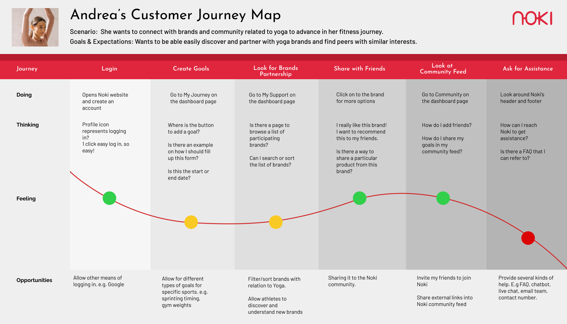
For Andrea, there are several areas and opportunities that can be explored to strengthen her experience with Noki. She needs to be able to sign-up/login with ease and accomplish important tasks like setting a fitness goal and connecting with the community related to her sport. She would also like to be able to troubleshoot independently or reach out for assistance when met with a problem with the platform.
Develop and Deliver
Using the research data, findings and insights while focusing on Andrea’s main needs and experience and the business goals, we mapped out a feature prioritization table based on it’s percieved value and impact.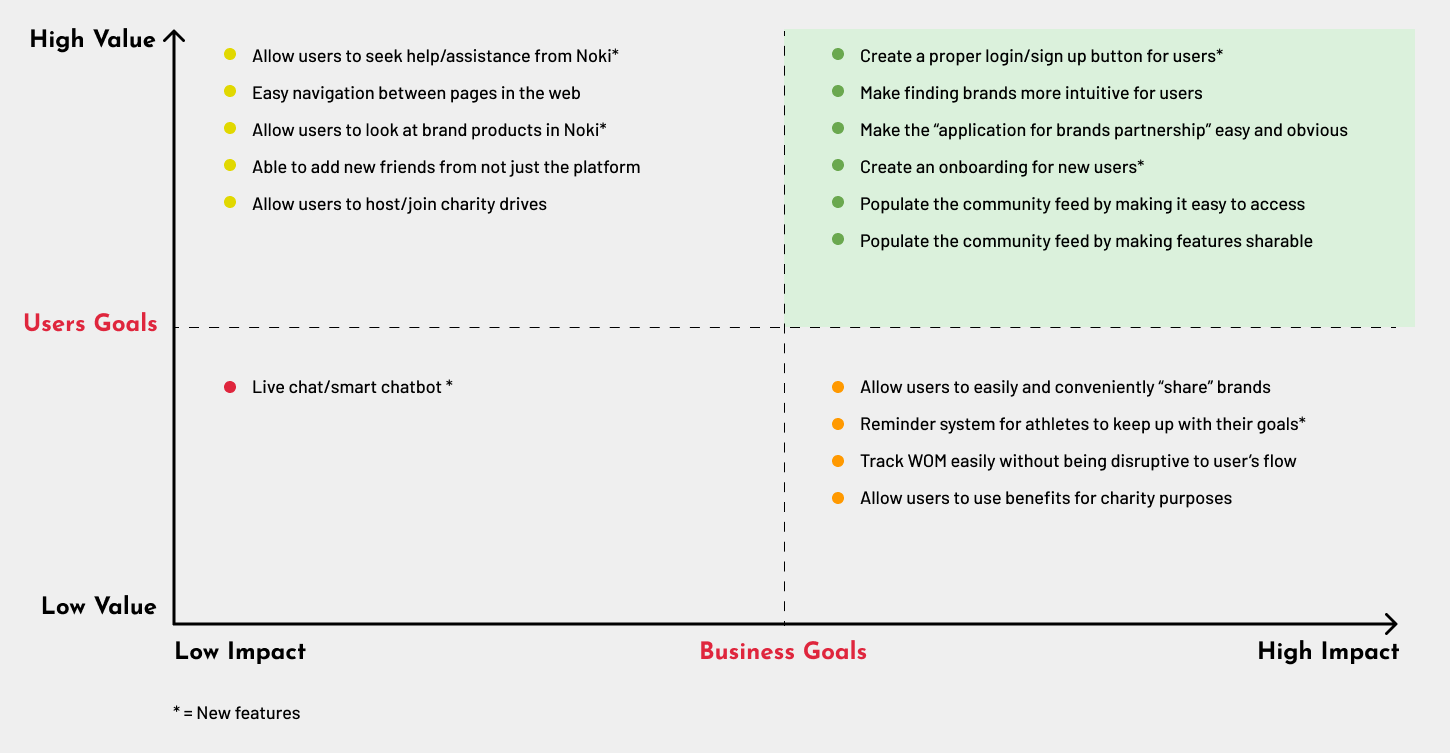
After discussing and in agreement with the stakeholder, we focused on developing features that would bring the highest impact and value for both user and business — (A) Onboarding, sign-up/login, (B) Goal setting, (C) Brands partnering, (D) Brands Recommendation & (E) Getting assistance. My team came up with ideas to improve the user flow and solve usability gaps that hinders task accomplishment. We discussed, sketched and came up with a wireframe with improvements on user flow, screen layout and feature designs. Due to the tight timeline, we focused on the mobile platform in the first round of design iterations as the Noki is a mobile responsive website.


︎︎︎ View lo-fi prototype 1
With the wireframe, we created a lo-fi prototype and conducted usability testings on 8 individuals whom were either active in a sport or work out regularly. They were given a scenerio base on our persona, Andrea and the 5 key tasks to accomplish. We are able to observe and collect insightful data and findings. Each participant was made to complete the Single Ease Question (SEQ) 7-point rating scale after each task to assess how difficult they found the task and the System Usability Score (SUS) survey to measure the overall usability of prototype 1.
Base on the SEQ & SUS scorings of the existing platform and prototype 1, we are able to observe an overall improvement in both scores. However, there were still clear issues with existing ambiguity in features, confusion in information architecture and usability hesitations in user flows. We found that participants did not find it intuitive to connect with brands under the navigation Partnership, it was unclear to users what content they were sharing when intended to recommend a brand to a friend and users did not understand the attachment feature in the Set Goal form.
![]()
We shared our usability testing results and insights with the stakeholder, discussed on the next steps and base on the results from prototype 1, our team ideated and sketched new solutions to improve the experience and solve the identified problems. We iterated our mobile wireframe and also designed the desktop wireframe. With our second design iterations, we created a design system for Noki and a hi-fi prototype for both mobile and desktop interfaces.
︎︎︎ View Noki Design System
The design system with the focus of conveying the modern and minimalist brand image of Noki, was created to ensure a cohesive and consistent UI across devices, to allow for optimum content efficacy and to ensure an enjoyable user experience. With the wireframe, we created a lo-fi prototype and conducted usability testings on 8 individuals whom were either active in a sport or work out regularly. They were given a scenerio base on our persona, Andrea and the 5 key tasks to accomplish. We are able to observe and collect insightful data and findings. Each participant was made to complete the Single Ease Question (SEQ) 7-point rating scale after each task to assess how difficult they found the task and the System Usability Score (SUS) survey to measure the overall usability of prototype 1.
Base on the SEQ & SUS scorings of the existing platform and prototype 1, we are able to observe an overall improvement in both scores. However, there were still clear issues with existing ambiguity in features, confusion in information architecture and usability hesitations in user flows. We found that participants did not find it intuitive to connect with brands under the navigation Partnership, it was unclear to users what content they were sharing when intended to recommend a brand to a friend and users did not understand the attachment feature in the Set Goal form.
We shared our usability testing results and insights with the stakeholder, discussed on the next steps and base on the results from prototype 1, our team ideated and sketched new solutions to improve the experience and solve the identified problems. We iterated our mobile wireframe and also designed the desktop wireframe. With our second design iterations, we created a design system for Noki and a hi-fi prototype for both mobile and desktop interfaces.
︎︎︎ View Noki Design System
We conducted a second round of usability testing on 10 individuals (5 mobile, 5 desktop) with the same scenerio and set of tasks. Likewise, each participant completed the SEQ after each task and SUS survey for prototype 2. We were able to observe an improvement in both scorings in prototype 2 as compared to prototype 1. Base on the mobile results of prototype 2, we found that users had hesitations with the limitations and lack of account sign-up/login options, they had difficulty fully comprehending the recommendation feature and had difficulty understanding the clear difference between the Dashboard and Profile features.
Base on the desktop results of prototype 2, we found that there was an oversight from the team’s part in not including a Logout feature, users did not understand what image to upload in the Brand partnership application form and Set Goals form due to the lack of context and there was ambiguity in the Set Goals feature in which it led users to believe they needed to perform more actions than what was required in order to complete the task.
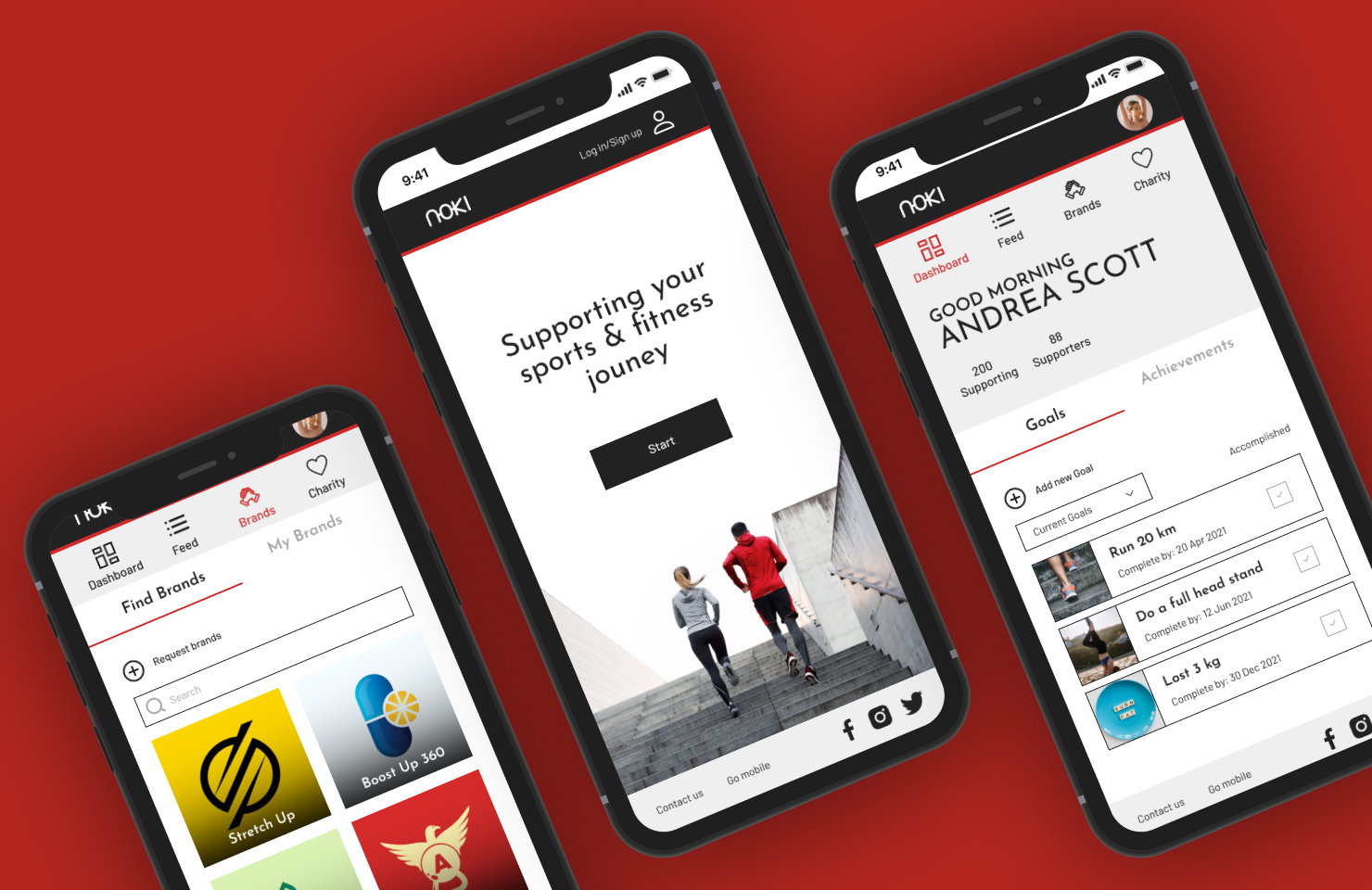
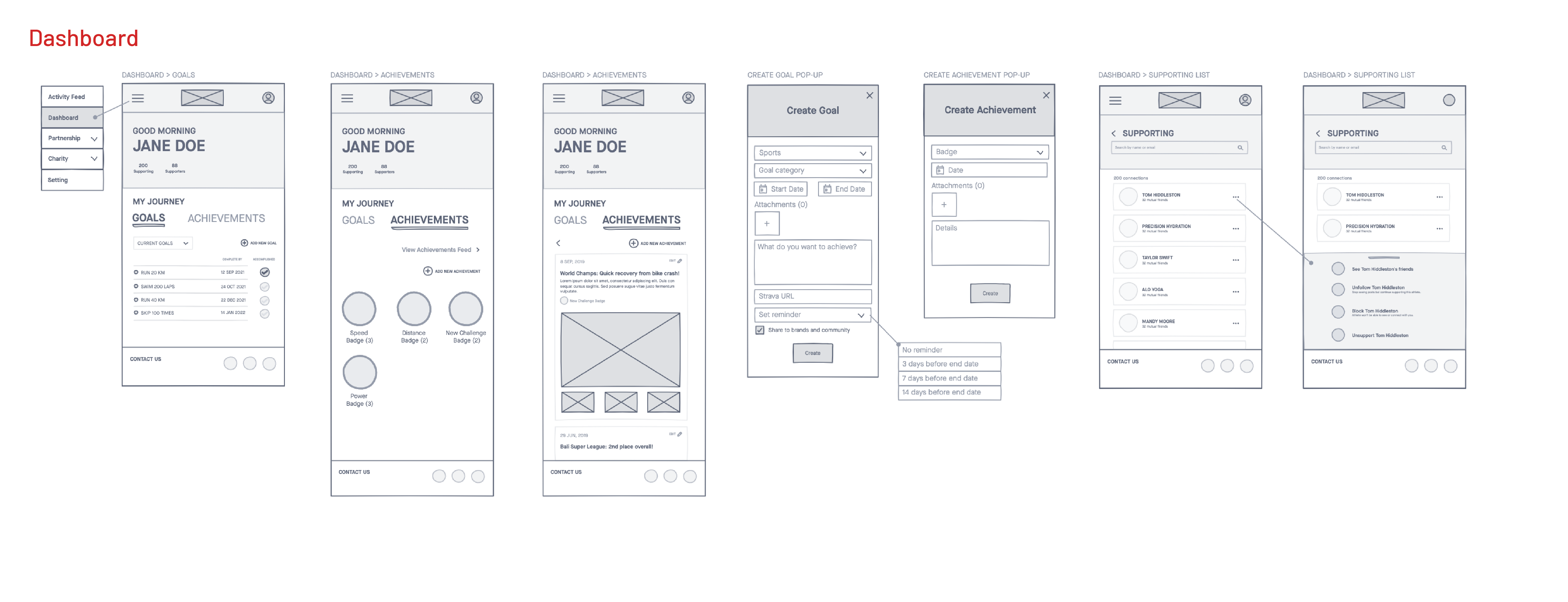
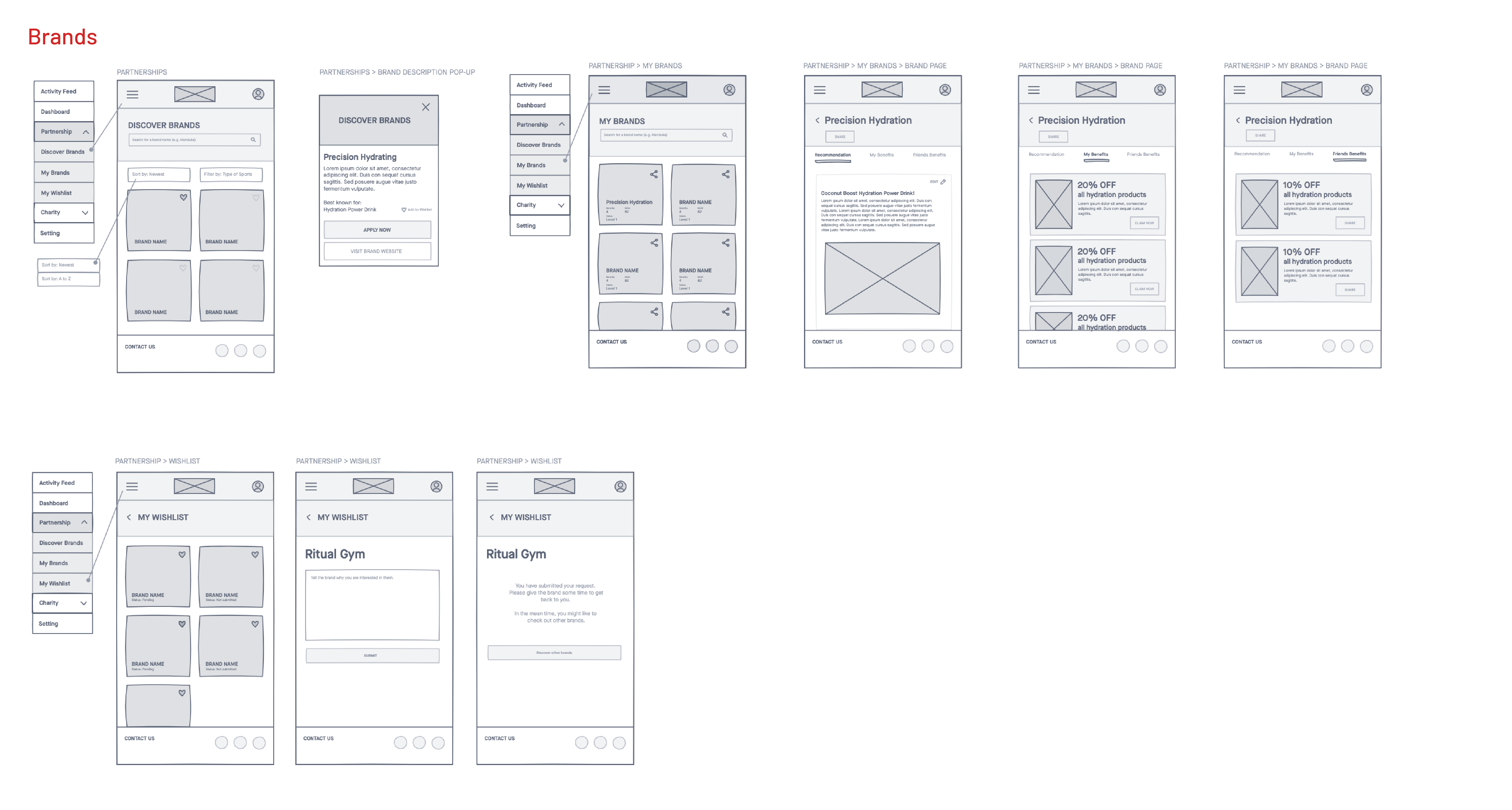
Key Product Screens (Desktop)
Onboarding Page

Athelete Dashboard
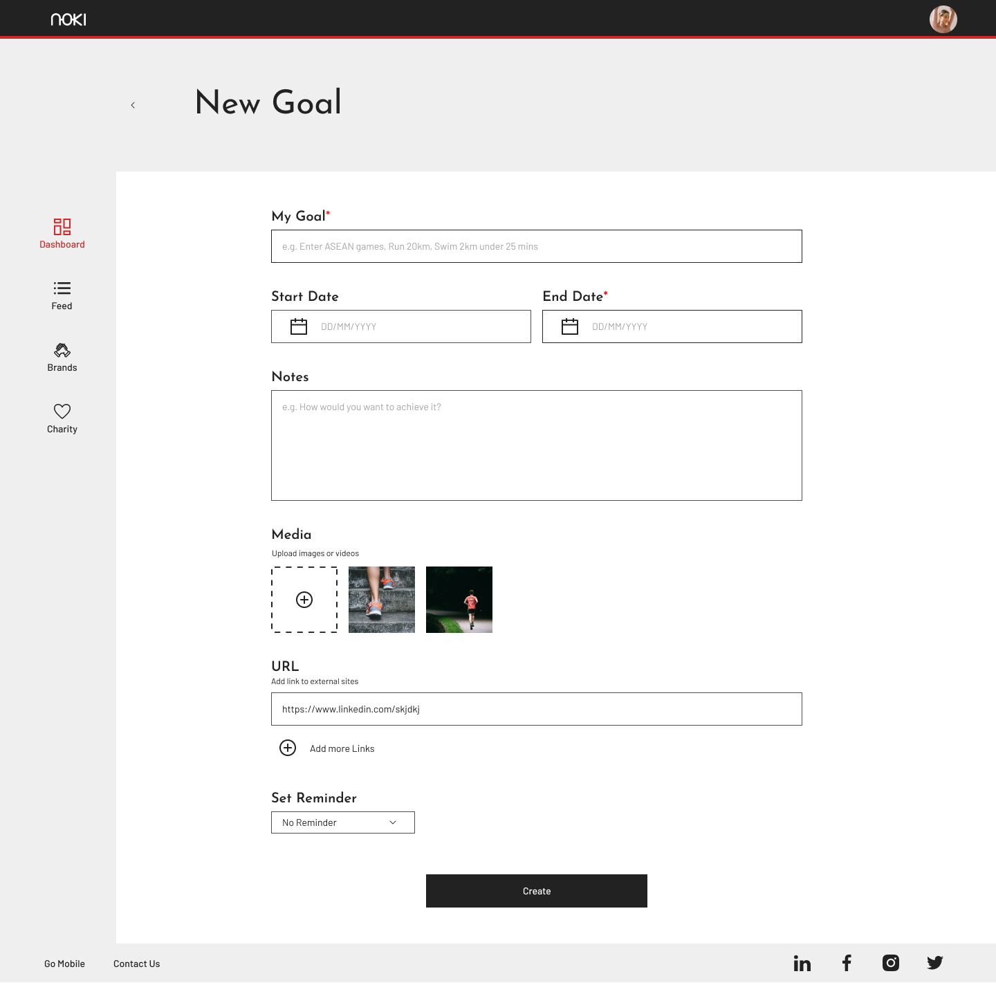
Create New Goal Page
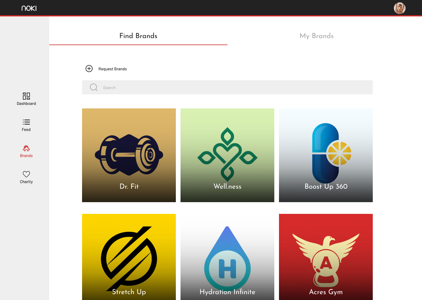
Find Brands Page
Partnership Application Form Page

Brands Benefits Page

Recommendation Pop-up
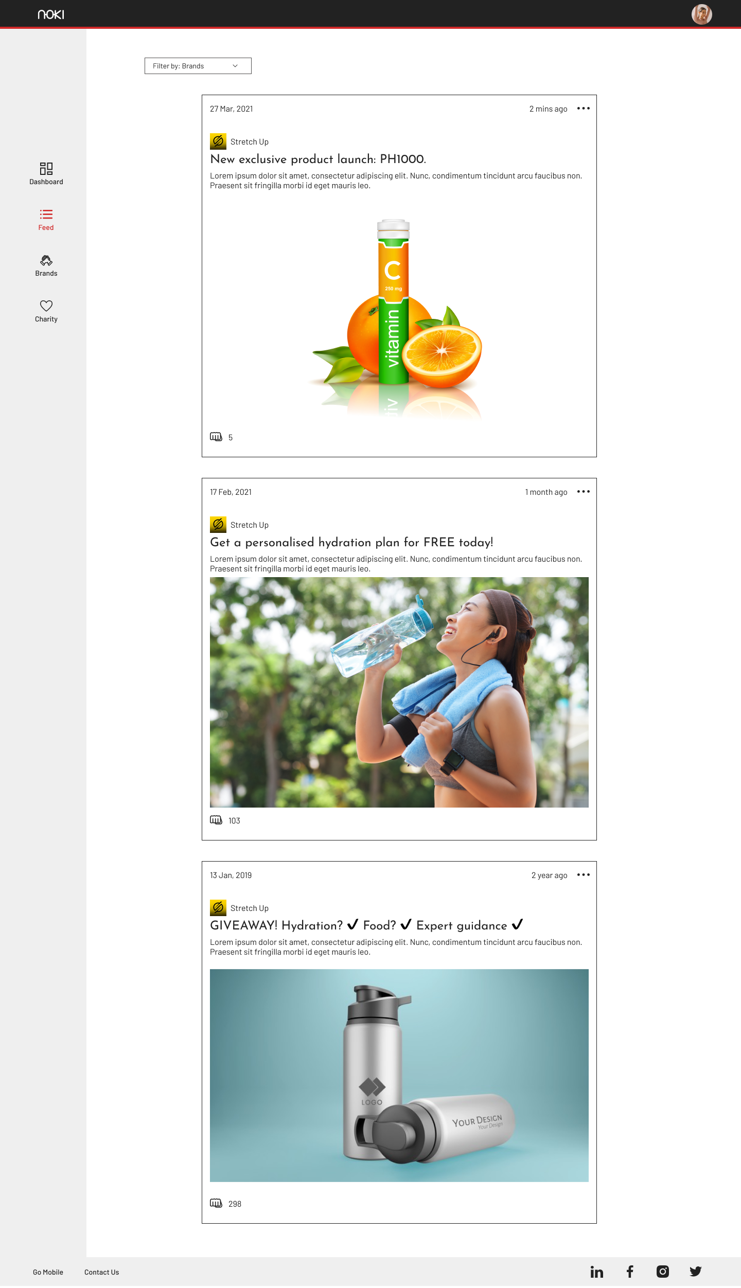
Activity Feed Page
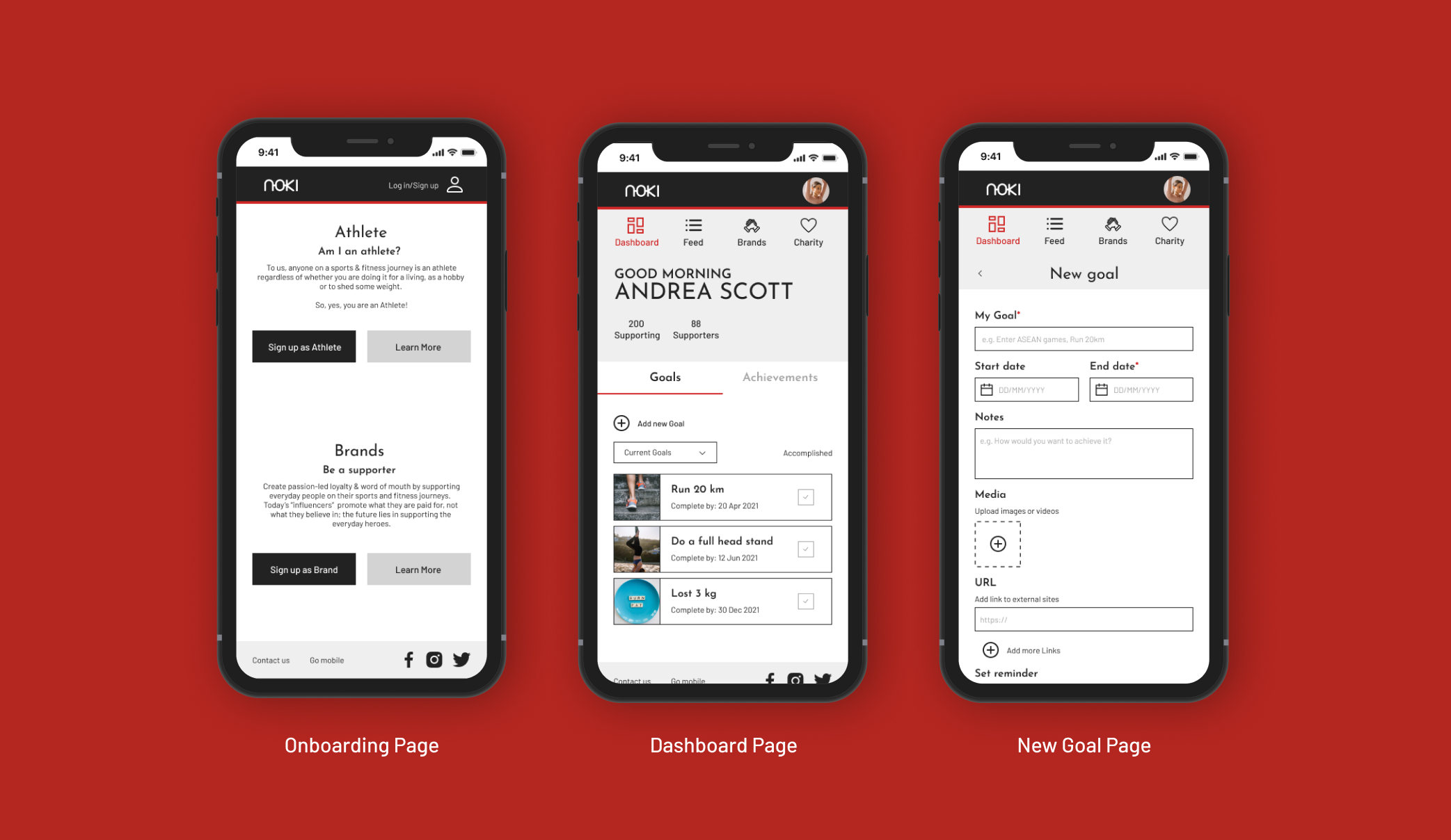
Key Product Screens (Mobile)
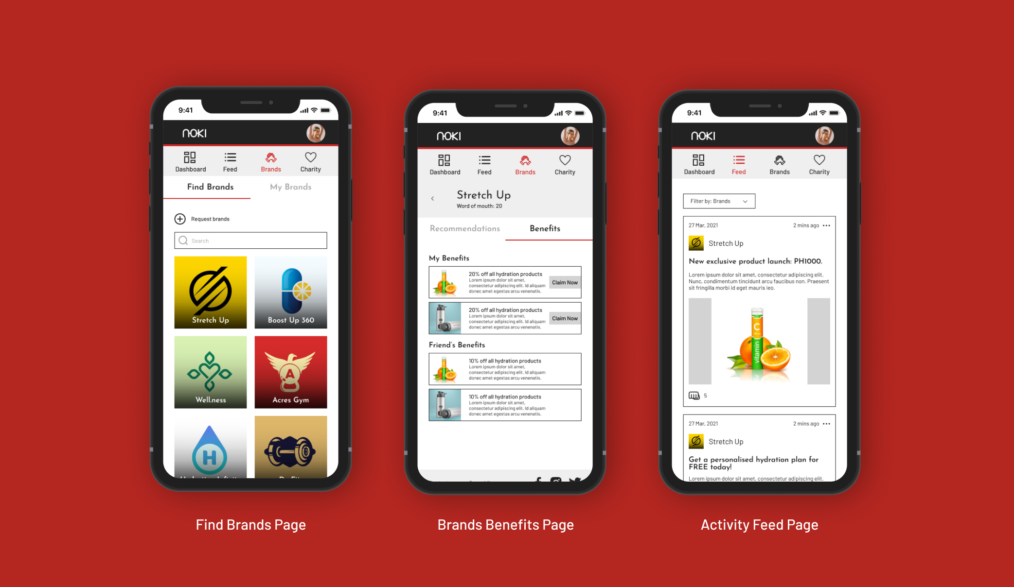
The main crucial iterations we did in this redesign exercise was to ensure end to end flow in the user journey and experience, to optimise each page for better information architecture, reduce the risk of cognitive overload and improve task succession rate. We introduced new components like cards to efficiently communicate information and content, different filter functions for user flexibility and form fill improvements based on real user experience data.
As we concluded the results and insights we gathered from the testing of prototype 2, we came to the end of the 3 weeks project engagement timeline and wrapped up our research, reports and design outputs. We shared the outcomes with the stakeholder in a presentation and discussed potential next steps for Noki. Our team was able to narrow and close gaps in the exisiting user journey, improve the overall UX experience with validated results and help set the tone, standards and direction for Noki that would influence the continuing future development of the platform.
Next steps
1.
︎︎︎To embark on the 3rd round of design iteration of the prototype based on the results and insights gathered from prototype 2.
Focusing on these areas:
︎︎︎To embark on the 3rd round of design iteration of the prototype based on the results and insights gathered from prototype 2.
Focusing on these areas:
- Streamline the Recommendation process
- Improve Goal page clarity
- Improve Partnership Application form clarity
2.
︎︎︎To find a cohesive design (both User Experience & User Interfaces) that balances between the features for Athletes and Brand on the Noki platform.
︎︎︎To find a cohesive design (both User Experience & User Interfaces) that balances between the features for Athletes and Brand on the Noki platform.
3.
︎︎︎Develop and include E-commerce into Noki’s platform.
Focusing on these areas:
︎︎︎Develop and include E-commerce into Noki’s platform.
Focusing on these areas:
- Users’ needs to acquire genuine reviews of the products
- Making clear on the concept of whether users will connect with the brands directly or Noki as the middleman
- Checkout flow is straight-forward and secure.
Learnings & Reflections
1.
︎︎︎Having open, good and regular communication with the client and within our team is very crucial in ensuring that we meet project timelines and outputs. It also ensure that we are able to highlight any issues or difficulties at a timely manner so as to address it efficiently.
︎︎︎Having open, good and regular communication with the client and within our team is very crucial in ensuring that we meet project timelines and outputs. It also ensure that we are able to highlight any issues or difficulties at a timely manner so as to address it efficiently.
2.
︎︎︎Setting the expectations and work methodology with all the stakeholders at the kick-off project meeting was vital as it allowed for everyone to have a clear understanding of the project pace and requirements. This ruled out the need for any guessing or belated revelation that could hinder the project.
︎︎︎Setting the expectations and work methodology with all the stakeholders at the kick-off project meeting was vital as it allowed for everyone to have a clear understanding of the project pace and requirements. This ruled out the need for any guessing or belated revelation that could hinder the project.
3.
︎︎︎It was important for us to understand and be aware of the technical limitations and thought-process behind the different decisions or exisiting features of the platform early in the project so as to factor that during our design and solution process. This allows for us to not duplicate past processes and waste precious time or create solutions that are not implementable.
︎︎︎It was important for us to understand and be aware of the technical limitations and thought-process behind the different decisions or exisiting features of the platform early in the project so as to factor that during our design and solution process. This allows for us to not duplicate past processes and waste precious time or create solutions that are not implementable.