
ZumVet App
Online vet care anytime, anywhere.
Overview
My Role
Duration
3 Months
Platform
iOS & Andriod
Full-time UX Design Lead
Duration
3 Months
Platform
iOS & Andriod
Tools used
Pen & paper, Google Documents, Mural,
Adobe Suite, FigJam & Figma
Responsibilities
Project Research, Ideation, UX Interface Design, Wireframe, Prototyping, Design System, Creative Direction, Testing
Pen & paper, Google Documents, Mural,
Adobe Suite, FigJam & Figma
Responsibilities
Project Research, Ideation, UX Interface Design, Wireframe, Prototyping, Design System, Creative Direction, Testing
📱 Download app
︎︎︎ For iOS
︎︎︎ For Andriod
Background
ZumVet is a leading online veterinary clinic in Singapore that provides a range of affordable and accessible pet care services, which includes teleconsultations, house visits, in-person clinic care, prescription refill and medication delivery. The services are only accessible solely via a web platform.The Goal
To create a mobile app that would allow users to book services and access medical records easily.The Challenge
To design an intuitive and seamless booking experience for the end-to-end user journey of a teleconsultation.Discover & Define
To discover the gaps in the current user journey, we conducted user interviews with 10 individuals who have experience being pet owners. By understanding their habits, behaviours, considerations on how they approach managing their pet’s health and when deciding to consult a professional, we synthesized the data using affinity mapping to identify common themes and patterns.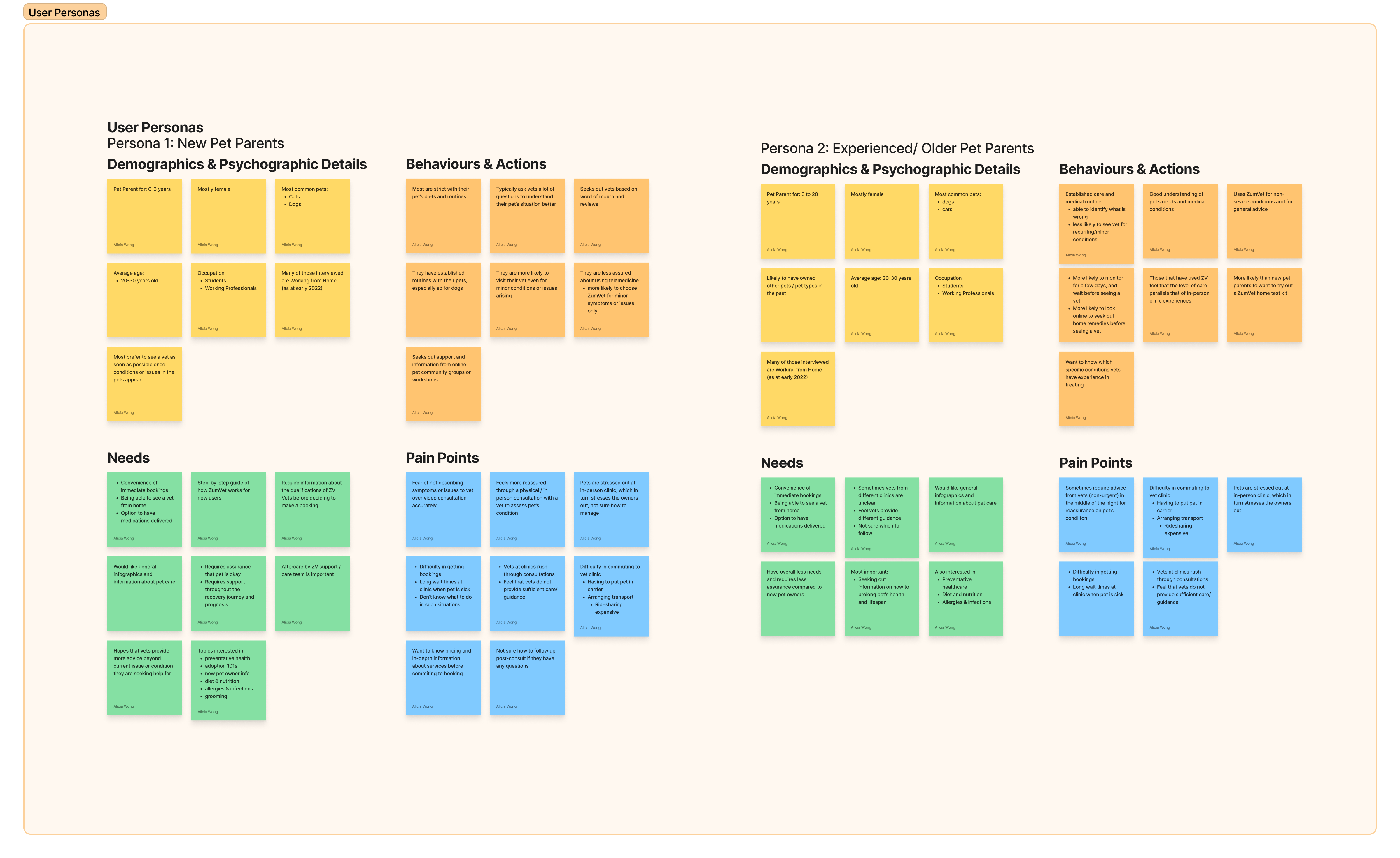
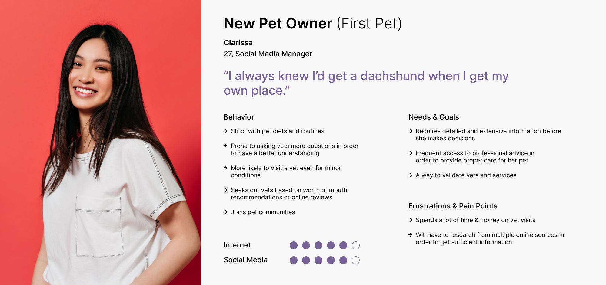
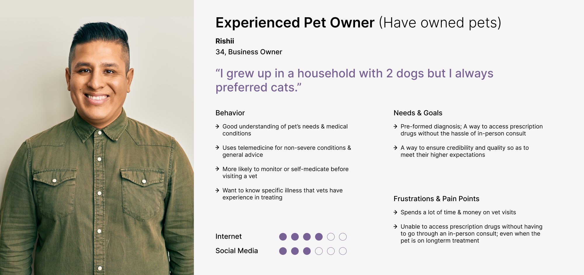
With the data and insights we discovered from the research & interviews, we were able to define and design the 2 main personas of our target audiences — (A) New Pet Owners & (B) Experienced Pet Owners, that will help guide the project.
...
Clarissa & Rishii needs an efficient way to speak to a vet and get medication delivered in order to care for their pets.
...
We conducted a review on the existing web booking flow. Mapping out the steps and effort required for a user from Pre-booking > Attending a Consultation > Post-Consultation.
![]()


Design & Deliver
Using the data from our analysis of the existing booking flow and Clarissa/Rishii’s needs and pain points, we brainstormed ideas on how might we reduce the number of back & forth, online & offline communication Clarissa/Rishii needs to make in order to secure a consultation, how might we reduce the possibility of failed bookings, how might we allow Clarissa/Rishii more visibility on processes and manage their expectations on waiting time and how might we allow Clarissa/Rishii easier access to help if they require.
We focused on developing features that would bring the highest impact and value for both user and business — (A) Booking Slots (B) Activity Status & Updates & (C) Chatbot (D) In-app Payment.
Taking into consideration the gaps of the exisiting userflow, pain points and needs of the personas, our team designed a new booking flow that was aimed to provide a more positive experience.
![]()
With the improved booking flow, we did sketches and wireframing to better envision the process and layout of the new features. The key iterations focused on creating an online booking system that allows users to view available booking slots of 20 mins timeframes. In order for the booking slots to be made available, we had to work with our operations team to come up with a vet roster. To enhance the booking process, we also aimed to improve the Health Conditions UI, making information inputs to be more intuitive and userfriendly by having common symptoms presented as quick select options. This reduces the effort needed for users to type and spell symptoms; reducing the risk of human error with mispellings. With the introduction of booking slots, we are able to give users an immediate confirmation of their booking, addressing the persona’s pain of multiple communication and long wait time. It also allows the business to take immediate payment to secure the slot.
Taking into consideration the gaps of the exisiting userflow, pain points and needs of the personas, our team designed a new booking flow that was aimed to provide a more positive experience.
With the improved booking flow, we did sketches and wireframing to better envision the process and layout of the new features. The key iterations focused on creating an online booking system that allows users to view available booking slots of 20 mins timeframes. In order for the booking slots to be made available, we had to work with our operations team to come up with a vet roster. To enhance the booking process, we also aimed to improve the Health Conditions UI, making information inputs to be more intuitive and userfriendly by having common symptoms presented as quick select options. This reduces the effort needed for users to type and spell symptoms; reducing the risk of human error with mispellings. With the introduction of booking slots, we are able to give users an immediate confirmation of their booking, addressing the persona’s pain of multiple communication and long wait time. It also allows the business to take immediate payment to secure the slot.
Using the current ZumVet brand guide as a guide, we created a design system for the ZumVet mobile app. The design system acted as a set of standards and guidelines for the UI interface. This would allow us to maintain design and layout consistency across all pages and devices when designing, which would help enhance and improve the overall user experience.
With the proposed booking userflow and design system, we started the sketching and wireframing process. With the mid-fi wireframe, we were able to create a quick and dirty prototpye to conduct a round of usability testing with 5 individuals. They were given the task to make an online consultation booking and interact with the prototype. The participants were also encouraged to voice out any of their thoughts and feelings throughout the testing. We are able to observe and collect insightful data and findings from the usability testing.
![]()
Here are the top insights from the testings:
Base on the results of the first iteration, we found that users wanted to be able to view critical information like timeslots and pricing before committing further into the booking flow, 3 out of 5 users show slight hesitation at the symptoms choosing screen as they felt the information presented was unclear/limiting.
![]()
With these new learnings and insights, our team discussed and iterated the userflow and wireframes to provide new solutions to improve the experience and solve the identified problems. We created a second round of design iterations. The selection of Date & Time was shifted earlier in the booking flow to address the needs of the users who felt that they needed more visibility on critical details for the booking and would reduce potential frustration.
![]()
With the proposed booking userflow and design system, we started the sketching and wireframing process. With the mid-fi wireframe, we were able to create a quick and dirty prototpye to conduct a round of usability testing with 5 individuals. They were given the task to make an online consultation booking and interact with the prototype. The participants were also encouraged to voice out any of their thoughts and feelings throughout the testing. We are able to observe and collect insightful data and findings from the usability testing.

Here are the top insights from the testings:
- 4 out of 5 users felt that they should be allowed to view & select available timeslots before inputting their pet information to avoid disappointment & frustration if there is no suitable slots
-
3 out of 5 users wanted to know pricing details before committing further into the booking flow
-
4 out of 5 users felt that the pet conditions input form was easy to use
-
5 out of 5 users felt that the flow was an acceptable length to complete
Base on the results of the first iteration, we found that users wanted to be able to view critical information like timeslots and pricing before committing further into the booking flow, 3 out of 5 users show slight hesitation at the symptoms choosing screen as they felt the information presented was unclear/limiting.
With these new learnings and insights, our team discussed and iterated the userflow and wireframes to provide new solutions to improve the experience and solve the identified problems. We created a second round of design iterations. The selection of Date & Time was shifted earlier in the booking flow to address the needs of the users who felt that they needed more visibility on critical details for the booking and would reduce potential frustration.
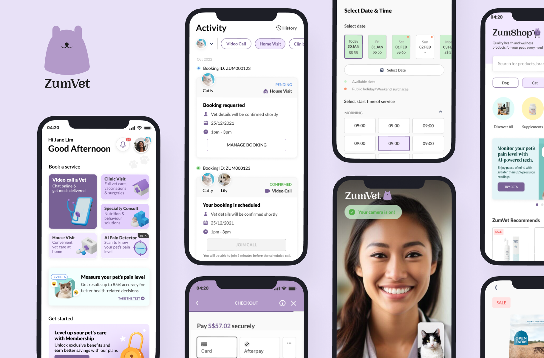
Key Product Screens
Select Date & Time
Open Calendar
![]()
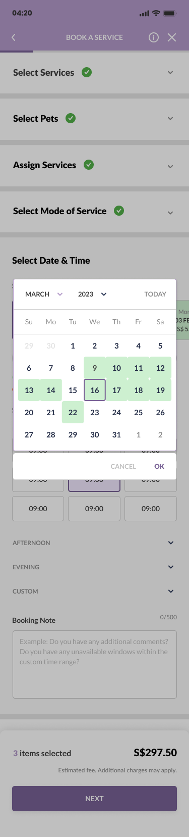
⭐ KEY POINT
To address the need of a timely and straight-forward way to secure a consultation appointment.
To address the need of a timely and straight-forward way to secure a consultation appointment.
- Available Date & Time slots are presented clearly for users to select.
- Prices are reflected on the slot, enabling better decision making.
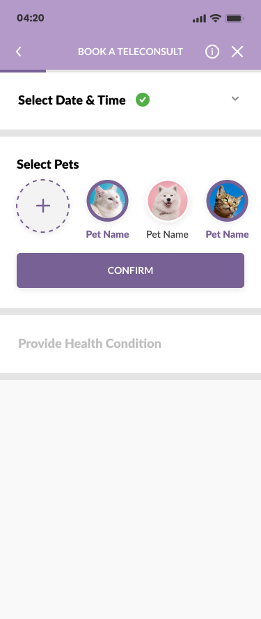
Select Pet Profile![]()
Provide Health Conditions
![]()
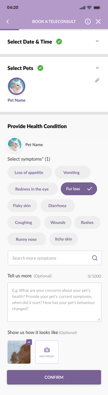
⭐ KEY POINT
To enhance the booking process, by improving the UI for easy information input.
- Having the different form inputs showcased in cascading order in a single screen allows user to have a clear overview of the booking process. It also helps reduce and pace the cognitive load.
- Selection of symptoms in pill form allows for easy input, less effort and reduces human errors in misspelling.
- Ability to add media in the booking process facilitates the consultation process, allowing for an increase accuracy of diagnosis & treatment plan.
Booking Summary
![]()
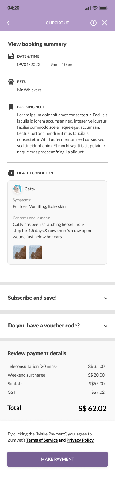
Make Payment
![]()
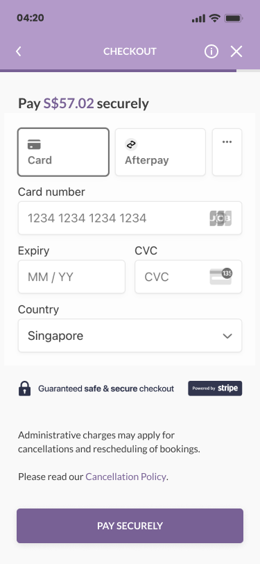
⭐ KEY POINT
Allowing the users to make payment in the same flow significantly reduces drop-out rates of incomplete bookings and help achieve business goals.
Allowing the users to make payment in the same flow significantly reduces drop-out rates of incomplete bookings and help achieve business goals.
- Improving the scheduling portal allows for immediate confirmation and payment which reduces the actions required for a user to secure a consultation.
- Users is able to acheive their goal of securing a consulation faster.
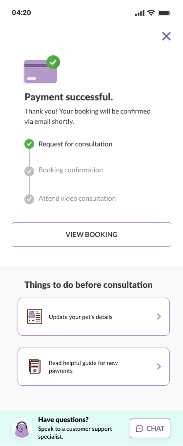
Payment Success
![]()
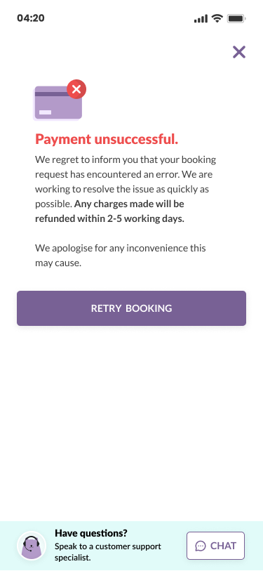
Payment Fail
⭐ KEY POINT
To address the persona’s need to have more touchpoints and visibility on processes/updates.
To address the persona’s need to have more touchpoints and visibility on processes/updates.
- Progress bar provides clarity & better manage users’ expectations.
- Customer Service Live Chat can be accessed to address any further enquiries.
- Offering options of things to do before the consultation encourages in-app activity and helps contributes insights and data, which can be leverage to help improved overall user experience.
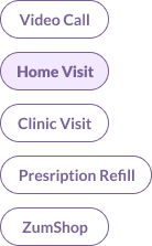
Activity

Types of Tags
![]()
⭐ KEY POINT
To address the persona’s need to have more touchpoints and visibility on processes/updates.
To address the persona’s need to have more touchpoints and visibility on processes/updates.
- Activity cards allow for users to review and track processes easily and recieve timely updates.
- Users are able to view Consult Summaries, Purchase Medication and Manage Bookings independantly without having to contact Customer Support.
Outcome & Impact
- ~9000 app downloads (last update Sep 2024)
- 26% increase in teleconsultation bookings MoM
- 13.9% decrease in customer support for scheduling
- 30% increase in monthly revenue
Next Steps
Building on the teleconsultation booking flow as the core feature, we aim to expand service offerings by integrating options like Specialist Consultations, Clinic Visit bookings, AI features and more. Our goal is to enhance the app's functionality by increasing touchpoints that drive more user engagement, ultimately positioning ZumVet as an integral part of their pet's healthcare journey.Learnings & Reflections
1.
︎︎︎As part of the scheduling portal, vet on duty was initially planned to be reflected as it was one of most common request we recieved from active users however, due to business constraints this was not made possible. Hopefully this can be revisited in future.
︎︎︎As part of the scheduling portal, vet on duty was initially planned to be reflected as it was one of most common request we recieved from active users however, due to business constraints this was not made possible. Hopefully this can be revisited in future.
2.
︎︎︎Automating the scheduling process was a significant improvement for the business and product as a whole. It also felt very rewarding to get good feedbacks from users regarding the flow and UI.
︎︎︎Automating the scheduling process was a significant improvement for the business and product as a whole. It also felt very rewarding to get good feedbacks from users regarding the flow and UI.