
V.Sport
Fitness delivered.

Overview
Type
Conceptual
Conceptual
Team
UX & Branding team of 1
UX & Branding team of 1
Duration
2 Weeks
2 Weeks
Responsibilities
Project Research, Ideation, UX Interface Design, Branding & Creative Direction
Project Research, Ideation, UX Interface Design, Branding & Creative Direction
Platform
Desktop
Desktop
Tools used
Pen & paper, Google Documents, Google Slides, Optimal Workshop, Mural & Figma
Pen & paper, Google Documents, Google Slides, Optimal Workshop, Mural & Figma
Brief
To create a hi-fi prototype for a new e-commerce platform with key product discovery and checkout pages.Approach
V.Sports is an online e-commerce website aimed to offer sportswear goods to both male and female audiences with a wide selection of trendy designs.The goal of this project was to uncover insights from sportswear shoppers and identify the behaviors, considerations and habits in their current shopping journey focusing on the Product Discovery and Checkout flows in order to create a platform that would appeal and answer their shopping goals and needs. I aimed to create a unisex brand image that is energetic, dynamic and versitile.
Discover and Define
I kickstarted the project by conducting user interviews with 7 individuals that have had experience purchasing sportswear online and/or in brick and mortar shops. By understanding their habits, behaviours, considerations and insights on how they shop for sportswear, I synthesized the data with affinity mapping to identify common themes and patterns.I learnt that users are:
- Rely on customer reviews to validate sellers online & determine product’s reliability.
- Take their time to learn about the product(s) before deciding to purchase it.
- Have an active lifestyle.
- Use personal criteria like budget and aesthetic preferences to guide their shopping journey.
- Feel that by shopping online, they are able to maximise their time and effort spent.
With the data and insights discovered, I designed a primary persona to help guide the project and it also provides a face to the platform that I am designing for allowing for visualisation.
...“I cant stay still for too long, I definitely need my weekly dose of sun & sweat!”
...
“I cant stay still for too long, I definitely need my weekly dose of sun & sweat!”
...

Meet Benjamin Adams, a 31-year-old single man who works as a Project Manager. He has an active lifestyle as he works out 3-4 times a week. He is a regular shopper of sportswear who is familiar with both online and in brick and mortar shops. He likes to view different selections of sportswear in order to find the one that best suits his needs and preferences; however, he dislikes having to go through multiple processes in order to make his purchases.
For Benjamin, keeping in mind of his goals, needs and pain points, there are several concepts and opportunities that can be explored. He needs a multi-brand website to view different product listings without having to visit multiple websites, a secure checkout system to safeguard his finances and to be able to view product inventory status and customer reviews. He would also like to have a product filter feature to shop efficiently.
Develop and Deliver
In order to plan and inform the sitemap of the e-commerce platform to ensure that it is intuitive, I conducted an open card sorting exercise with 30 participants and 48 product cards to find out how people would group products together and how they identify these groups.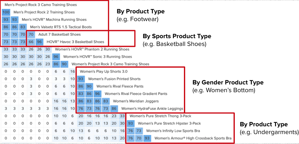
Studying the data and groupings, based on how the cards are grouped and the percentage of how similar items were often grouped together across different participants, I was able to make an informed inference that users mainly group the products by:
1. Product Type (e.g. Footwear)
2. Sports Product Type (e.g. Basketball Shoes)
3. Gender Product Type (e.g. Woman’s Bottom)
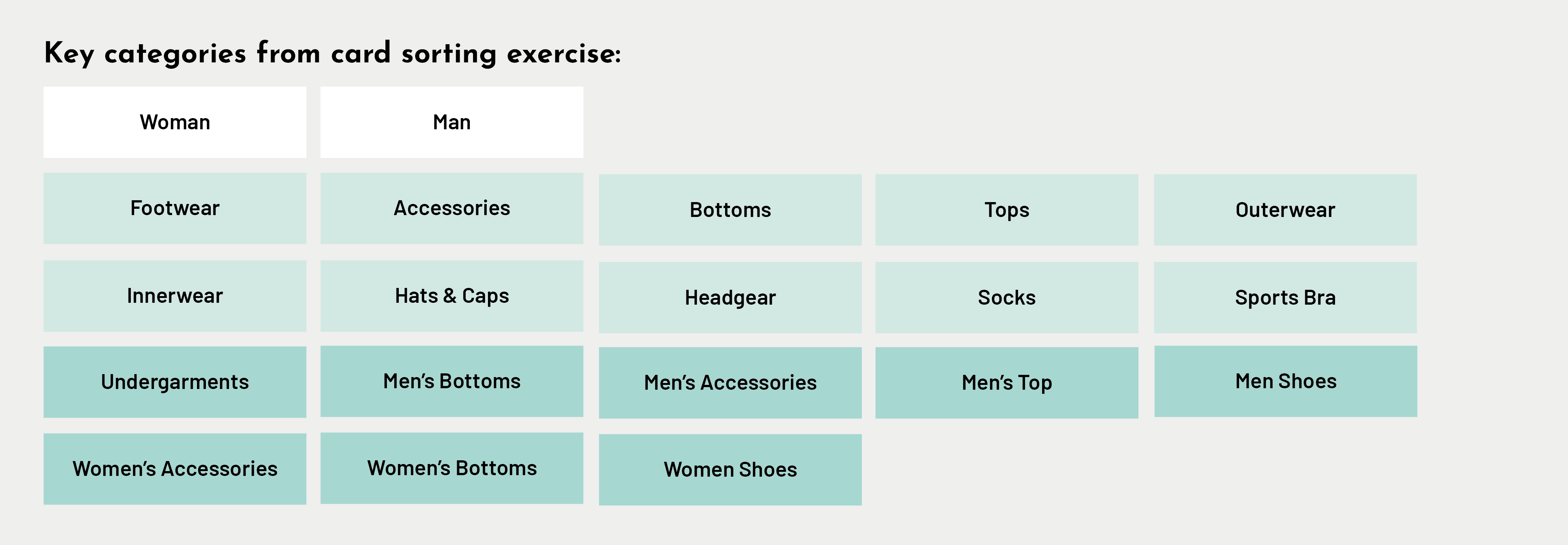
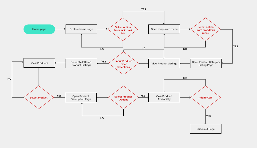
I was also able to identify the key categories from the card sorting exercise and used it to inform the different product groupings for the website’s sitemap. I created a user flow diagram with a scenario and task base on Benjamin’s needs and goals. This allows me to be able to plan and visualise the different steps and considerations for the happy path of the user’s journey.
Prototype 1 (Wire flow)
Based on the results, I learned that users tried to discover products by “Shop by Sports/Running” navigation which was not developed, they were looking for a size guide to help inform their purchase decision, there was a missing page link from Home banner/Latest Footwear to Mens Footwear that disrupts the user flow and checkout page had confusing details, repetitive actions and multiple minor issues that adds up to leaving users feeling uncertained and insecure about the checkout process. Each participant was made to complete the Single Ease Question (SEQ) 7-point rating scale after each task to assess how difficult they found the task.
Base on the SEQ scorings of prototype 1, there were clear rooms for improvements such as providing additional entry points for product discovery base on user’s behaviors and to refine the user flow of the checkout process making it more straightforward and efficient while ensuring important details are included for better system status visibility and meeting user’s expectations. I did a second round of design iterations to improve and solve the identified problems and with prototype 2, conducted another round of usability testings with 5 individuals, given the same scenerio and tasks.

Prototype 2 (Wire flow)
Key Website Screens
The 2 crucial iterations from prototype 1 to prototype 2 was firstly, the discovery to check-out flow where I learnt that the process was not efficient and contained repetitive actions so the user flow and wireframe was streamlined. The product added pop-up was removed and upon selection of the cart icon, user can proceed directly to the check-out flow. The other iteration that was focused on was the check-out page where users felt there was lacking information that made the process feel less secured. Information like shipping lead time, price and product image was added throughout the Order Summary for easy reference and added assurance with better payment transparency.
Home Page

Product Listing Page

Product Description Page

Check-out Page /Login
Check-out Page /Delivery
Check-out Page /Payment
Base on the results, I was able to observe an increase in the SEQ scoring for both tasks from prototype 1 to prototype 2. I learnt that there was minor errors highlighted such as system visibility error in the breadcrumbs listing and misspelled navigation button. Users would also like for free shipping cost to be reflected for additional clarity and button size to be bigger for more visibility.
As I concluded the results and insights gathered, I came to the end of the 2 weeks project timeline and wrapped up the research, reports and design outputs. I shared the outcomes in a presentation and discussed potential next steps for V.Sport.
Next steps
1.
︎︎︎To add a tracking system in the platform allowing users to be updated on their purchased order at real-time. This gives users more control, visibility and would enhance the overall user experience with V.Sport e-commerce website.
︎︎︎To add a tracking system in the platform allowing users to be updated on their purchased order at real-time. This gives users more control, visibility and would enhance the overall user experience with V.Sport e-commerce website.
2.
︎︎︎To do more research and create the wireframes for the other pages of the main navigation (New in, Women, Kids, Brands & Sale). Looking into conducting user interviews to understand how they shop uniquely in these categories to understand their needs, expectations and experience.
︎︎︎To do more research and create the wireframes for the other pages of the main navigation (New in, Women, Kids, Brands & Sale). Looking into conducting user interviews to understand how they shop uniquely in these categories to understand their needs, expectations and experience.
3.
︎︎︎To create a design system for V.Sport to document and standardise overall design components. This will help ensure a cohesive and consistent UI across pages, allowing for optimum content efficacy and an enjoyable user experience.
︎︎︎To create a design system for V.Sport to document and standardise overall design components. This will help ensure a cohesive and consistent UI across pages, allowing for optimum content efficacy and an enjoyable user experience.
Learnings & Reflections
1.
︎︎︎I realised that there are many things to consider and take into account for an e-commerce website as the interface’s main aim is to make the experience as seamless, easy and efficient for the users as possible ensuring sales and user retention. I would like to relook into these areas as I further develop the website as to ensure the proposed solution best fits the persona and answers his needs.
︎︎︎I realised that there are many things to consider and take into account for an e-commerce website as the interface’s main aim is to make the experience as seamless, easy and efficient for the users as possible ensuring sales and user retention. I would like to relook into these areas as I further develop the website as to ensure the proposed solution best fits the persona and answers his needs.
2.
︎︎︎Creating interactions in Figma was challenging and not as intuitive for me as I had no prior knowledge nor experience with the programme but with lots of trial and error, online tutorials and help from my peers and mentors, I was able to achieve a basic satisfactory level of interaction for my prototypes that was sufficient to convey the idea and allow for usability testings. It was a great learning experience for me and I would say, to not feel intimidated or shy to reach out to others for help as it not only allows for better learning but also a great way to form connections and build relationships.
︎︎︎Creating interactions in Figma was challenging and not as intuitive for me as I had no prior knowledge nor experience with the programme but with lots of trial and error, online tutorials and help from my peers and mentors, I was able to achieve a basic satisfactory level of interaction for my prototypes that was sufficient to convey the idea and allow for usability testings. It was a great learning experience for me and I would say, to not feel intimidated or shy to reach out to others for help as it not only allows for better learning but also a great way to form connections and build relationships.
3.
︎︎︎With my background in visual design, I enjoyed applying visual design principles and practices into the hi-fi prototypes. It allowed me to be able to bring out the brand’s energetic and dynamic identity but also helped in creating a good visual balance, increased content legibility, reduced cognitive overload and worked to create an overall enjoyable user experience.
︎︎︎With my background in visual design, I enjoyed applying visual design principles and practices into the hi-fi prototypes. It allowed me to be able to bring out the brand’s energetic and dynamic identity but also helped in creating a good visual balance, increased content legibility, reduced cognitive overload and worked to create an overall enjoyable user experience.